
Alexander Grabovetskiy, woodcarver, School of Woodcarving · Published 2022
How do you know a carving drawing is wrong before you carve it?
Quick answer: A wrong drawing for carving is one where the ornament fights the main subject instead of holding it up. Something grows as large as the subject's head, two shapes match, a line crowds its neighbor or a patch goes dead. On my butterfly plate every one of those turned up, and I settled each one in pencil.
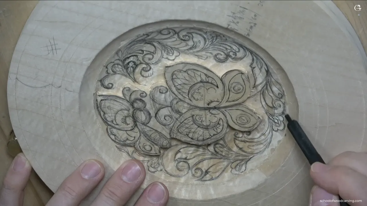
You check a carving drawing by comparing sizes and gaps, and you do it while everything is still pencil. On this plate I caught a volute as big as a butterfly's head, two flowers too much alike, a curl I had to call no good and one patch I did not like. None of it cost me wood.
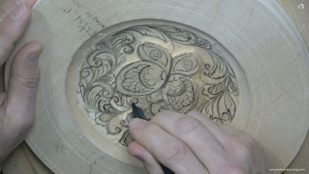
Ever spent an evening carving and only then noticed one little curl fighting the butterfly? Wished you had seen it before the first chip came out? In this lesson I do not carve at all. For about 35 minutes I draw curls, flowers and leaves around the two butterflies, and I keep stopping to judge what I just drew.
If you are coming straight from lesson three, the butterflies are already outlined and standing a little above the background. You could stop right there, to be fair. Leave the ground plain, carve the border, and nothing is wrong with that plate. I wanted more going on inside, so the space around them had to fill up with ornament, and every shape I added was one more chance to get it wrong.
What I caught in pencil on this plate
- Judge a shape square on. From an angle, or through a camera lens, a good curl looks bent.
- A new curl picks up the butterfly's own arch, or swings back against the curl before it.
- Nothing beside the motif may match the size of its head.
- Where two flowers match in size, one of them shrinks.
- Roughly 3 mm (1/8 in) off the butterflies' outline, and about 1.5 mm (1/16 in) between the little shapes.
- Grow a leaf into a dead patch, and leave some ground open where things are packed.
Why check a drawing before any blade touches it?
Pencil moves in a second, and carved wood never moves again. The school already has pages about the other kind of mistake: why a carving mistake cannot be undone, how to recover a line you already carved away and how a crowded acanthus design gets fixed. Two of those start after the blade is in. The acanthus one takes on a single problem, crowding. This page is the whole run of checks I make with the pencil still in my hand.
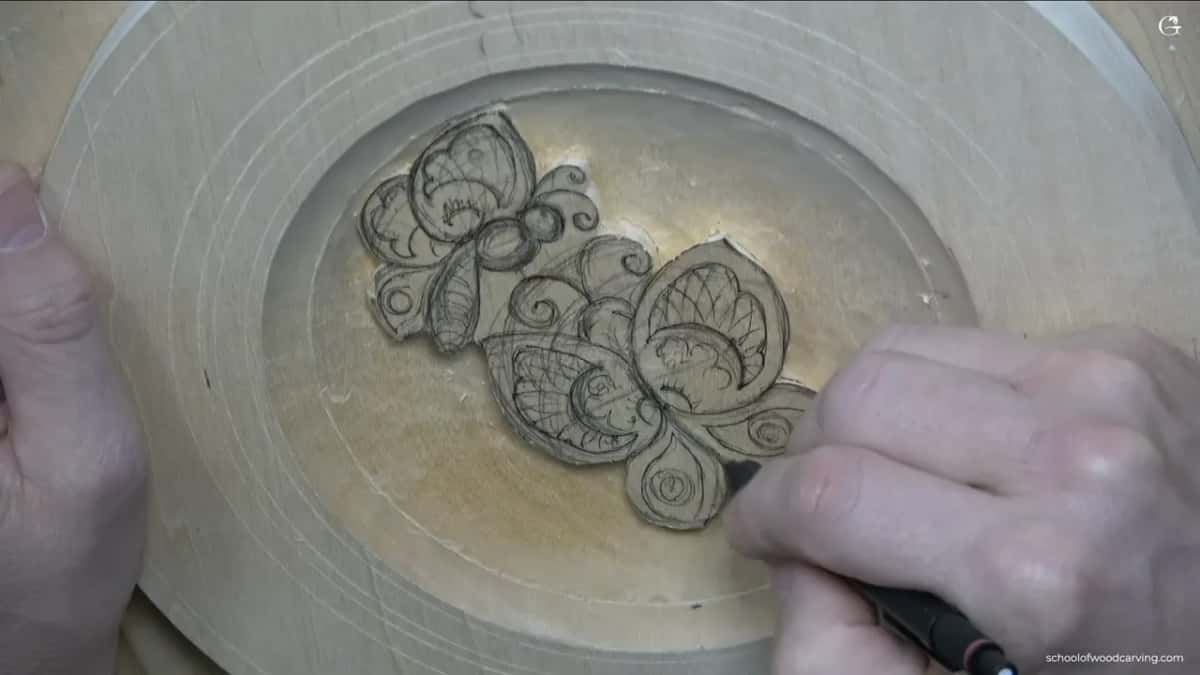
I do scan my drawing and put the pattern up on the school site, so you can print it and carve. Even so, I highly, highly, highly recommend you draw it yourself. It is the same few movements over and over, and once your hand knows them you can put this kind of ornament on pretty much anything you like. Drawing it yourself is how you get to be wrong in pencil, where it costs nothing.
Is the board square to your eye when you judge it?
Turn it until it is, or you will end up fixing curls that were never wrong. On camera my drawing looks twisted in places. My camera sits a little in front of me, so you never get a true straight-on view of the plate, and a curl that is fine in real life looks pulled out of shape.
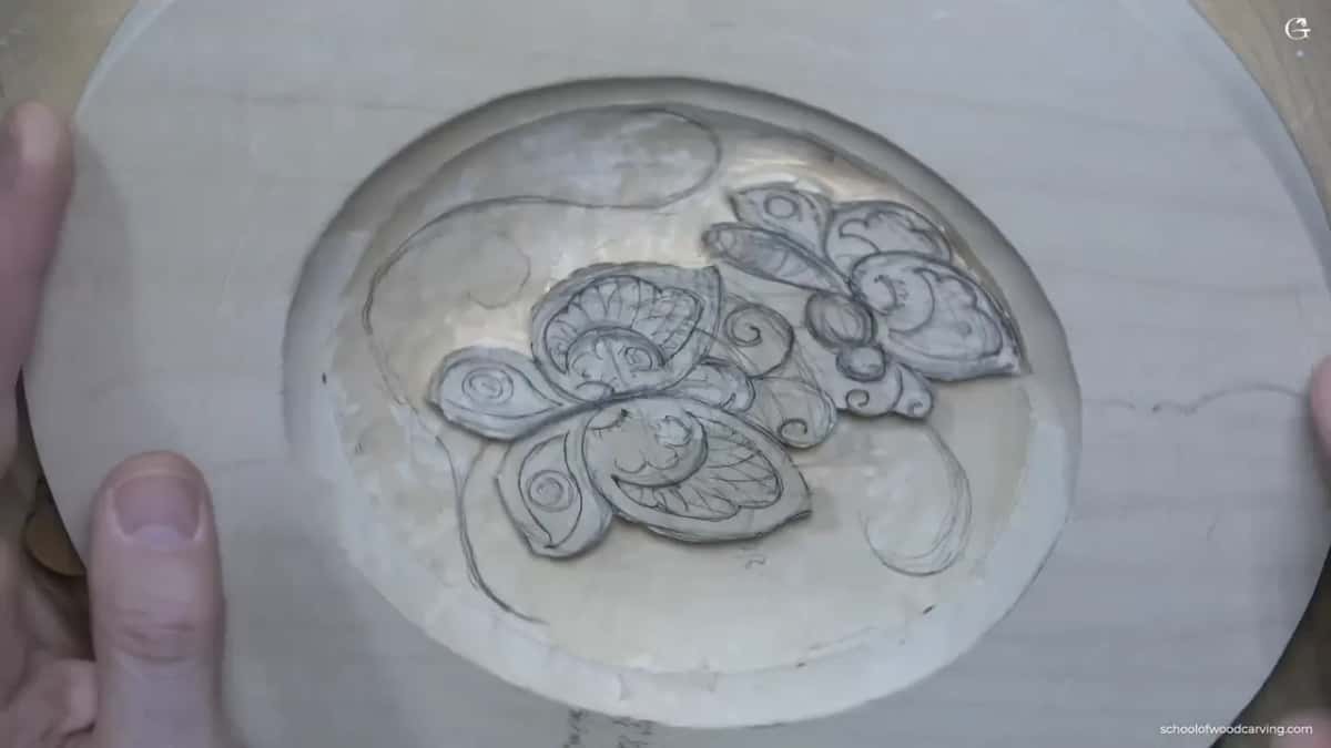
At one point in this lesson I turn the plate toward you. From where you sit it just does not look right, and once it is rotated it becomes right. A scan has the same trouble. The scanner will not give you true parallel projection either, which is one more reason I want you drawing the plate rather than trusting the printout line for line.
So before you call a shape wrong, stand right over it, or spin the board, and look at it straight on.
Does each new curl carry the movement or fight it?
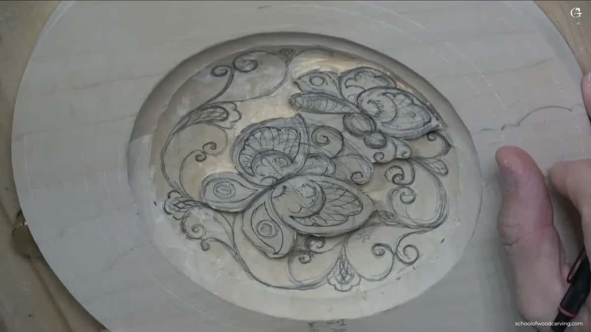
Each one should carry it, and the first one starts from the butterfly itself. My butterfly arches one way, so the main line of the ornament picks up that arch, keeps it going and then splits off in other directions. After that it is repetition. If this side curls one way, the next curl turns the opposite way.
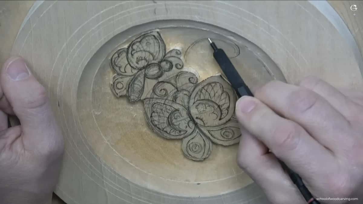
Partway down the right side I caught the first bad one and said it out loud, really not great, this is no good. I drew it again, curling it against its neighbor, and it sat much better. Sometimes I just stop. Let me think, I say, what is going to look good.
A smaller curl can grow straight off a volute, turned the other way again. Weaving them together is fine, and not required. If you carved a curly board with me, you already know this family of scrolling movements, the old curly style.
What happens when a curl is as big as the butterfly's head?
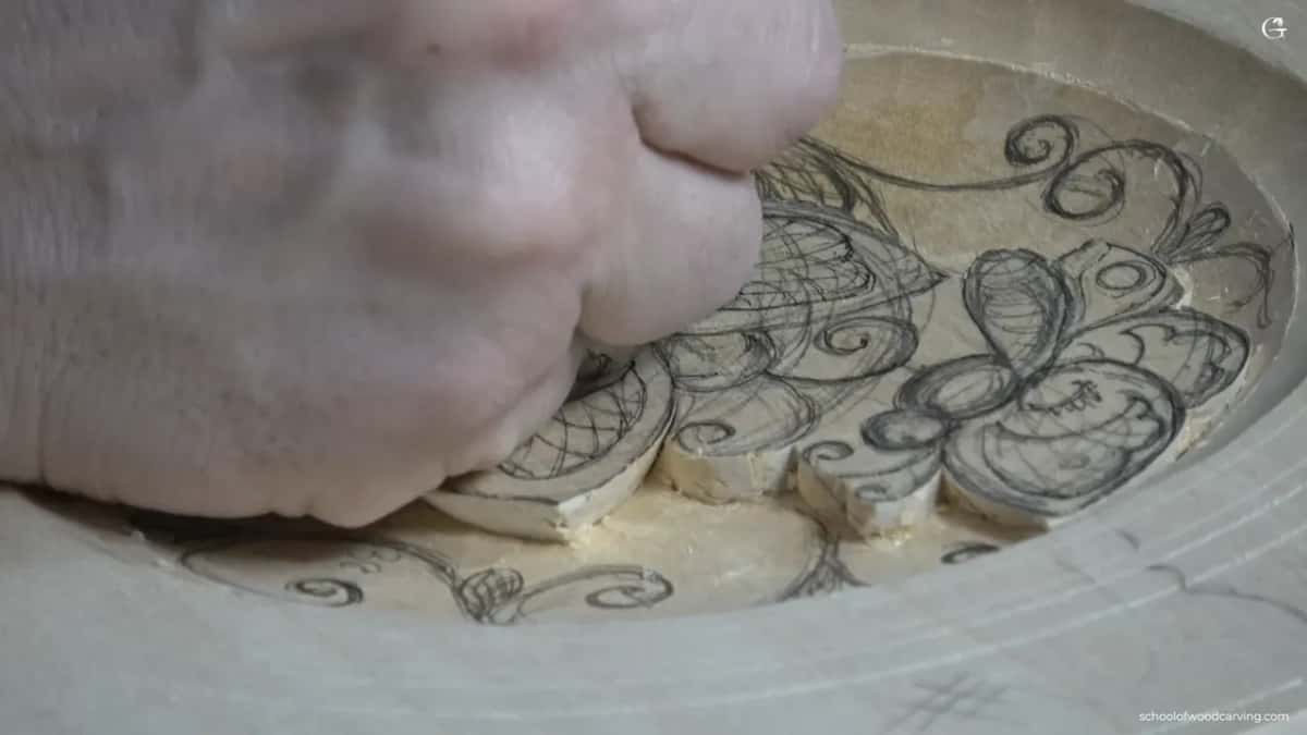
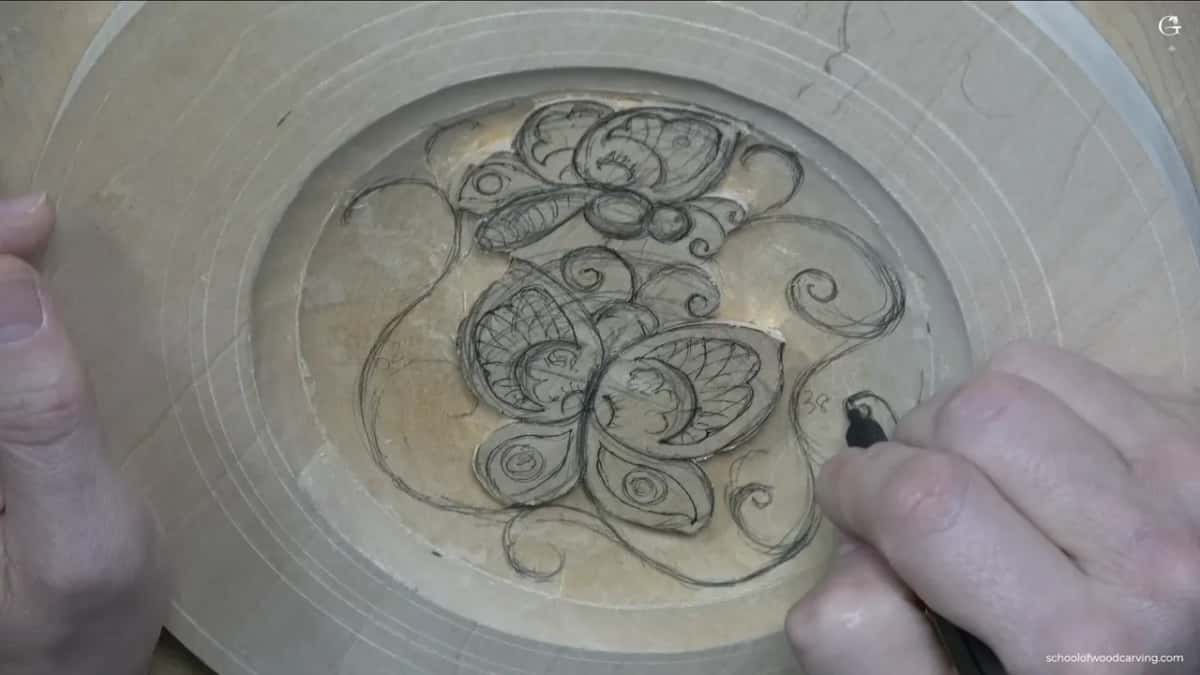
The head gets lost in it. That nearly happened to me here. I was drawing a volute the opposite way and thought maybe it could get even bigger, and then I saw the head right beside it, about the same size. That head I did not want to lose. I made the volute smaller, and my verdict on the first try, word for word, was no bueno.
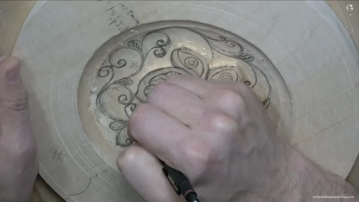
The whole point of the ornament is to make those butterflies pop out of the design. Small shapes around them do that. A shape the size of the head works the other way, which is the law of space turned against you. Most of my volutes on this 10 inch (254 mm) plate stay tiny, about 5 or 6 mm (1/4 in), with the smallest near 3 mm, an eighth of an inch. One I let grow to about 10 mm (3/8 in). Back in the first part I had already told myself another one had to be a little smaller.
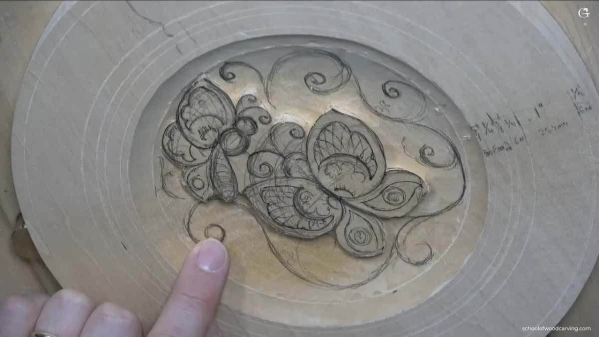
Every one of these stops is on camera, in all three parts of the lesson, and students of the school can watch the pencil go back over each shape.
Why do two flowers of the same size look wrong?
A matching pair looks too similar, so one of the two flowers has to shrink, and by a lot. I had drawn a flower on each side, the same flower in two good spots, and I liked both spots. Seen together they were too similar.
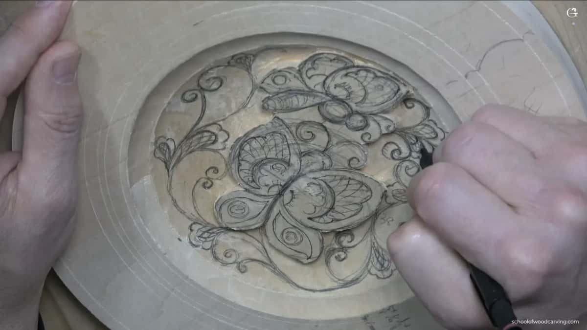
So one flower went much smaller, and the space it gave back had to be filled with something else. Before I forgot which kind of flower went where, I put a mark on it. Curls work on the same idea. Where two sit side by side, one is bigger, roughly 60 against 40, which is the golden ratio said simply, and I told you on camera you do not have to calculate it. A little flower can even sit away from the spot between two movements and still look really awesome.
How close is too close for two pencil lines?
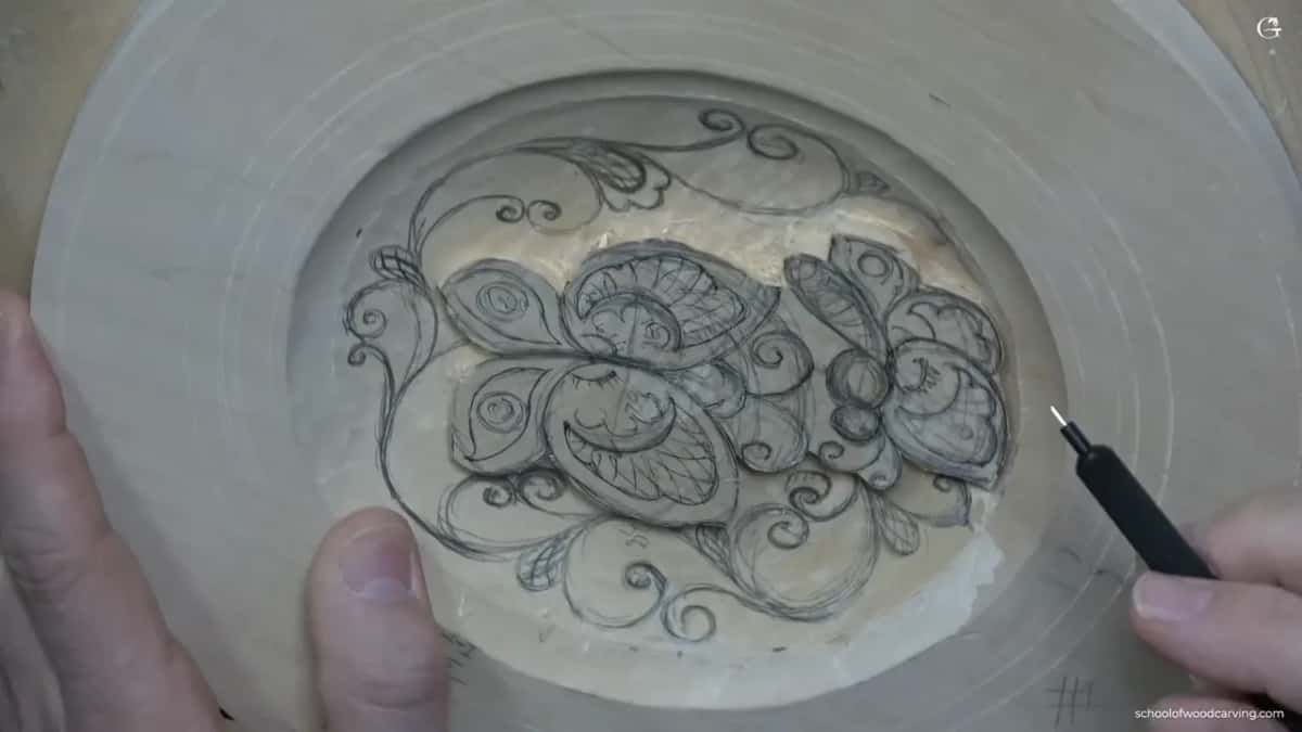
About 1.5 mm, a sixteenth of an inch, between the small shapes, and about 3 mm, an eighth, between the ornament and the butterfly line. Those are two different gaps. The course page gives you the 3 mm one, and that number is the distance from the scratched outline of the butterflies. Between one curl, leaf or flower and the next goes the smaller gap.
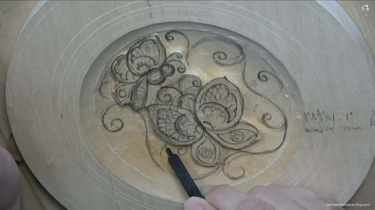
Even where you cannot see a gap yet, leave it. A separation cut goes in there later, and there will be one everywhere, everywhere, everywhere. Too close is something you judge by eye, though. One of my lines ended up a little too close to its neighbor. I doubted it would look really nice. Then I looked longer, said maybe it's good, maybe it's good, and left it.
In one spot I stopped short of the full 3 mm on purpose. More movements were coming there, and they needed the room.
Here are the main stops from the lesson in one place, with the fix I used.
| Check | Found | Fix |
|---|---|---|
| Square to your eye | Seen from the camera, curls that were fine looked twisted | Turned the plate |
| Curl follows the arch | One curl on the right side was simply no good | Redrew it curling the other way |
| Nothing beside it outgrows the head | A volute grew about as large as the butterfly's head | Made it smaller |
| No twins | Two flowers came out much too similar | Shrank one and filled the space it gave back |
| Gaps held open | One line crept a little too close to its neighbor | Kept it after a longer look, since it looked right |
| Dead or packed patches | One area I really did not like | Grew a leaf into it and kept the movement going |
Does every shape belong to the style?
Every shape has to belong to the style, and here the style is stylized ornament. In stylized carving you have to be authentic, as I say near the start of the lesson, so the movements are not meant to be grass or anything from a garden. Just ornament.
The big open area between two volutes asked for more. This one I have to be more creative, I said, and a larger spreading grid went in there. I added a couple more of the same idea and stopped. More than two I did not need. Earlier I had said something like it about the volutes, this is the last one I want to do, and moved on to the flowers.
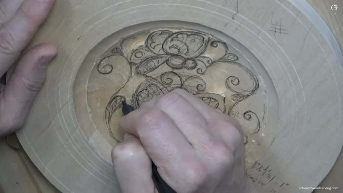
Should every empty spot get filled?
Leave a few wide ones open on purpose. Late in the lesson I was filling every spot I could find with tiny curls, and then I stopped myself. Maybe I am not going to do it everywhere, I said, maybe this is not good.
The wider openings I left alone. There is no need to fill everything, and those wide spots matter too, like negative space, which I think is a good term for them. The opposite problem showed up a minute later. I looked at one area and said, I don't like this area, I really don't like this area.
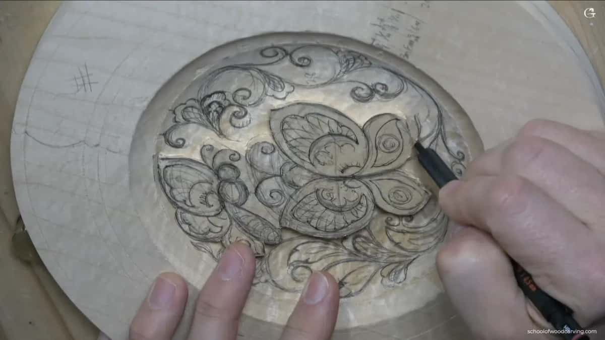
That patch needed something in it, so I grew a leaf in there that repeats the movement around it. Crowded ground gets mass taken away. Dead ground gets a leaf. As I said on camera, you cannot make a volute without some neighboring detail, and that is why the little shapes stay.
What does a leaf need before you trust it?
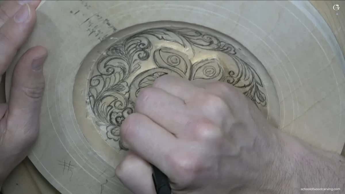
A taper, first, with one end clearly wider than the other. If a leaf runs the same width all the way along, it will not look as nice, and I said exactly that while I drew one. Each leaf follows the overall movement, a lot of nearly parallel lines running the same way, and gets a small separation right down the middle.
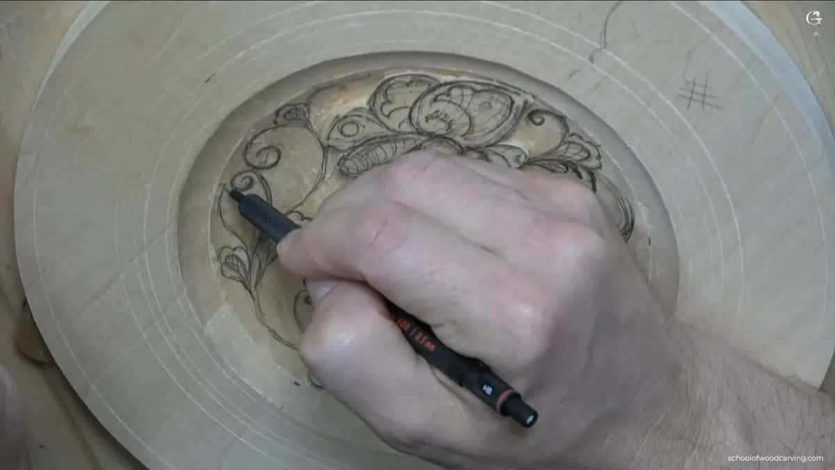
The movement inside my first leaf came out a little too big. My first reaction was, I don't know if I like that. But it was okay, so I left it the way it was for now and moved on to the next leaf. Not every doubt needs fixing on the spot, and some of the separations do not even need drawing yet. Those I add a little later.
The flowers get just as much thought. Mine are the old northern kind, three strokes that are not really petals, and a small grid spreads out from one point inside them. Not a square grid like a jail cell. Flowers like these are common to the Nordic style of the eighth and ninth century.
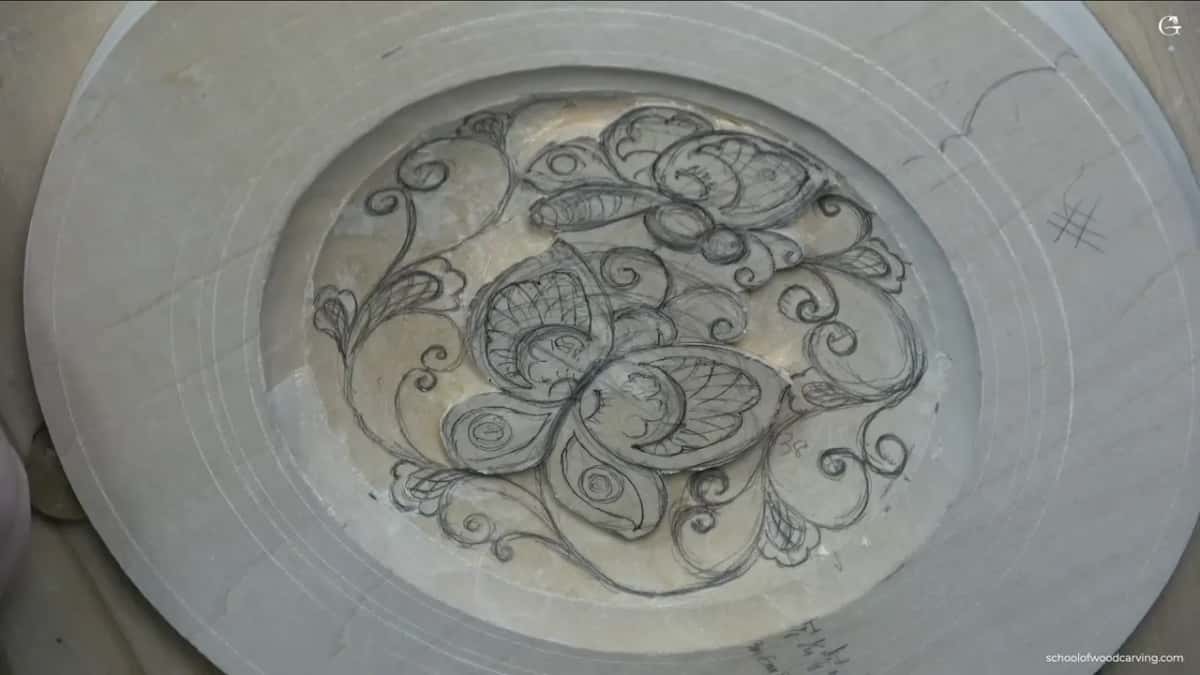
What is the last look before the knife comes out?
A slow one, done three times over. Near the end of the leaves I stopped and told myself, let me double check, double check, double check. The next words out of me were, I think I kind of like it. Kind of like it is not the same as finished, though. Earlier I had said nearly the same words and kept going, because what I had was only the main movement and a lot more detail still had to come.
Before I added two more flowers, I counted the ones I had one more time, in case I had simply miscounted. Nobody is going to count them on the finished plate, and I said on camera that you do not have to follow Fibonacci at all. I count anyway. Counting a design is just one more slow look at the drawing.
The tiny curly details go in near the end, and they stay shallow, since I do not want to dig out much wood in those small spots of the basswood. Once they are all in they repeat on their own, and the field starts to look right. The lessons after this one put the knife to all of it. With the pencil still in my hand, the last thing I said was, and so on, it should be good.
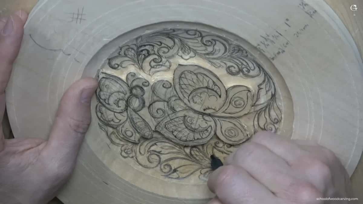
Do you want curls that hold your butterflies up, or curls that fight them for your eye? Draw first, judge it square on, and be honest about what you see. If the principles of design are new to you, start there.
How it's done
- Face the part squarely. Rotate the board or walk around it until you look straight down at the shape you are judging.
- Follow the main movement outward. Start at the arch of the motif. Every curl should grow out of the last one or swing back against it.
- Measure neighbors against the head. Nothing next to the motif may come near the size of its head. Shrink whatever does.
- Hunt for twins. If two flowers or curls match, make one clearly smaller and fill the room it frees.
- Hold both gaps. Keep an eighth of an inch (3 mm) off the motif outline and half that, a sixteenth, between small shapes, for the separations.
- Sort dead from crowded. Grow a leaf into a patch that feels empty. Leave a packed one alone and keep some wide spots open.
- Recount before changing anything. If a number bothers you, count again first. You may simply have counted wrong.
Frequently asked questions
Is the printed pattern for this plate accurate enough to trace?
Close, though not perfect. I scan the drawing and put it up for you, but a scanner gives no true straight-on projection, and my camera sat a little in front of me too. Use the print as a map. Then draw the ornament again with your own hand, right on the wood.
How much room do I leave between the little shapes?
About a sixteenth of an inch, roughly a millimeter and a half, from one small shape to the next. Keep that room even where you cannot see it yet. A separation goes there later. The wider gap, around an eighth or 3 mm, belongs between the ornament and the butterfly outline.
What if a part breaks the rule but still looks right to me?
Keep it. One of my own lines crept closer than I wanted, I gave it a longer look and decided it could stay. The 60/40 split and the flower count are the same kind of thing. Neither is required for this style of carving, and I said so on camera more than once.
What to carve next