
![Furniture Panel [ Pattern download ] and Depth map](/_next/image?url=https%3A%2F%2Fmedia.schoolofwoodcarving.com%2Fwp-content%2Fuploads%2F2019%2F10%2FCarving-Furniture-Panel-15.3.2-1024x576.jpg&w=3840&q=75)
Alexander Grabovetskiy, woodcarver, School of Woodcarving · Published 2017
How do you use a depth map with a relief carving pattern?
Quick answer: A depth map is a colored sheet showing how deep the background of a relief carving sits in each zone. For my walnut furniture panel I made it last, once the background was final, in three colors, the deepest 3/16 inch. You print the drawing full size, glue it on, and check each zone against its color.
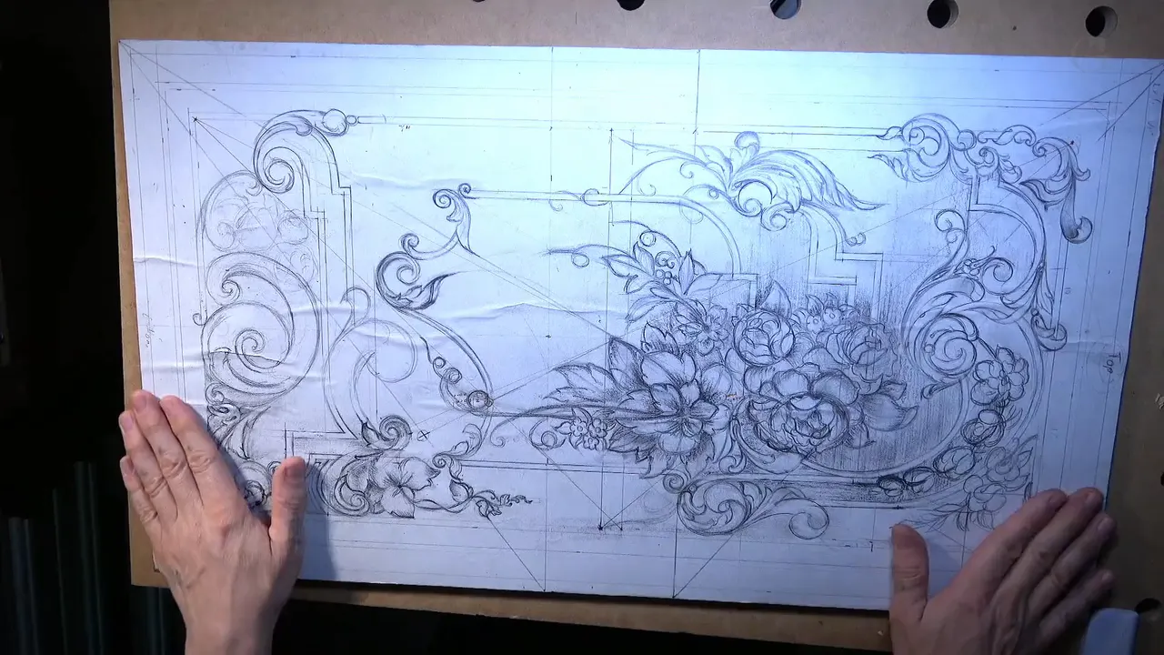
A depth map is a second sheet that comes with a relief carving pattern and shows how deep the background goes, zone by zone. Mine comes in three colors. On CNC sites the same two words mean something else, a gray height picture that a machine reads. This one goes with the drawing of my walnut furniture panel, for a carver working by hand with gouges, and I made it last.
Look at any of the relief carving patterns you can print. Every leaf and every stem is there? And all of it lies on one flat sheet of paper? Then the paper has no way to say how far down the ground goes beside a leaf. On this panel a second sheet says it.
Lines are what you see first on any pattern. By the end of this page you will know why my map came after the carving, what its colors mean on a board this thin, and what the shallow parts are holding up.
What the drawing and the map give you
The download holds a drawing of the panel as a jpg and a pdf, its size in inches and millimeters, the wood it was carved in, and a depth map.
The board is walnut, 3/8 of an inch thick, 10 mm, and the deepest ground on the map is 3/16, 5 mm.
I made the map once the background was off and every decision was final.
Shallow zones were left shallow so a thin panel keeps its strength and moves less.
In a frame, the rails hold it. Without one, older makers slid a cross grain piece into the back.
What comes in this furniture panel pattern download?
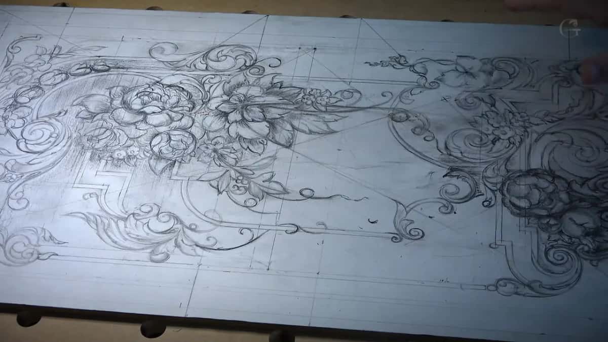
Four things, and I'd rather you know them before you click than after. A drawing of the furniture panel, as a jpg and as a pdf. The size in both systems, 3/8 by 15 1/2 by 27 1/4 inches, which is 10 by 393.7 by 692.15 mm. The wood, walnut. And the depth map of the panel.
Look at that first number again. Three eighths. On camera, in the opening lesson of the design course, I said this piece is only about three eighths of an inch thick, which is 10 millimeters. Before one line went on the paper I gave myself a limit. My plan was not to go deeper than three sixteenths of an inch, five millimeters. Really low relief. And I still wanted the effect of a three dimensional world out of it.
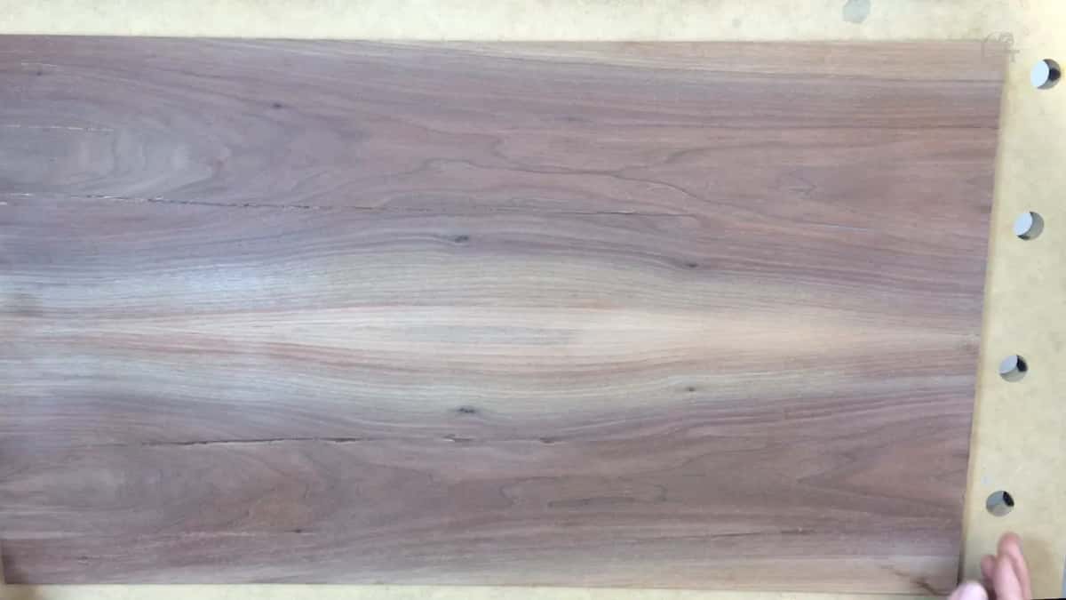
The sheet says walnut. Mine was not just black walnut, it was a purple walnut left over from a house I did, with splits in it. Some people call the style Chippendale, after Thomas Chippendale, but I said on camera it is not necessarily true Chippendale. Hundreds of carvers in the 18th and 19th century worked this shallow way.
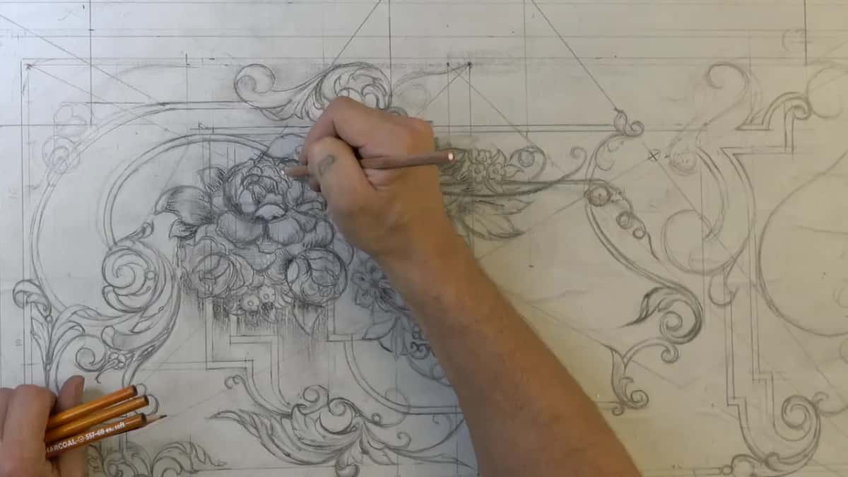
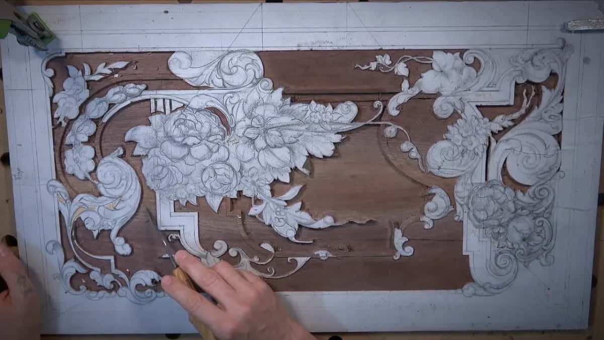
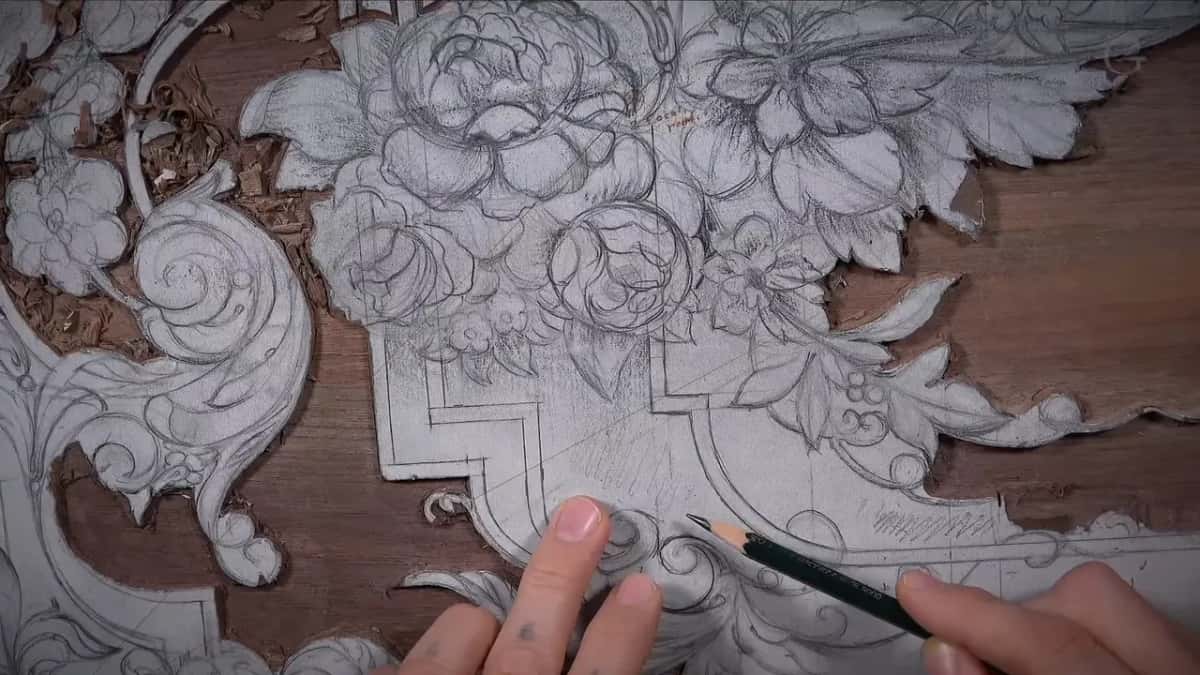
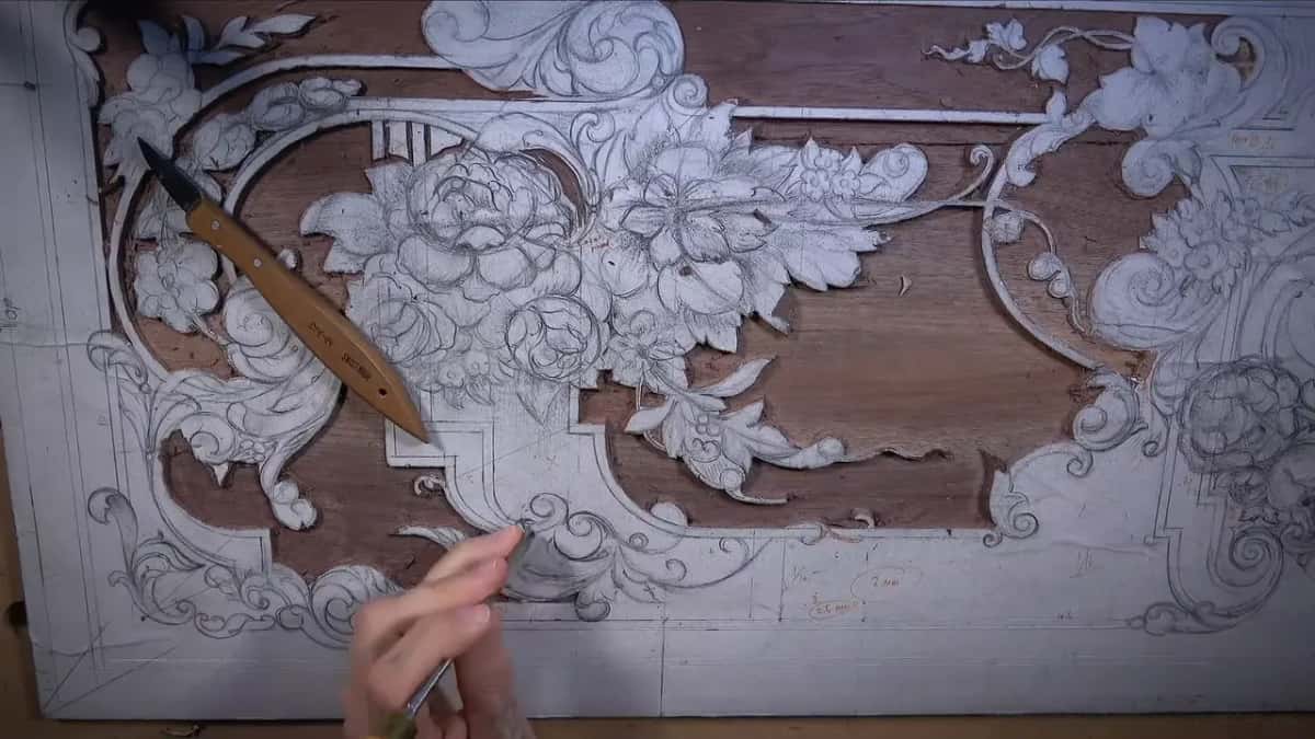
The drawing took the whole design course, fourteen lessons, on white paper glued over the board. I was not trying to make a beautiful piece of drawing, though I could if I wished to. Every line was there just for carving. Where a part goes lower I shaded it, the background with charcoal and a concave much darker, so the sheet already hints at what sinks and what stands. The charcoal lesson shows that part. A hint is all the shading gives. Shading says lower. It gives no number.
I also warned against overdoing it, back when I was shading the bottom of the panel. Don't create too much mass with charcoal and pencil marks, because you still have to be able to see and detect the lines when you carve. And a carving looks a little different from its drawing anyway. Once the chisel goes in, you see the tool marks, and the ridges they leave are what make the main movement.
Why did I make the depth map last?
A question came in. Deep in the background work of lesson 19, I mentioned it: could I provide a depth map? And yes, absolutely, I said I would. But not right then. In that same video I was taking some areas down to an eighth of an inch, three millimeters, the depth that later went yellow on the map.
I said I'd upload it once all the background was off, all my decisions were final, and there was nothing more to remove. That makes the map a record. It shows how far down I took the background, after the fact, on my own walnut.
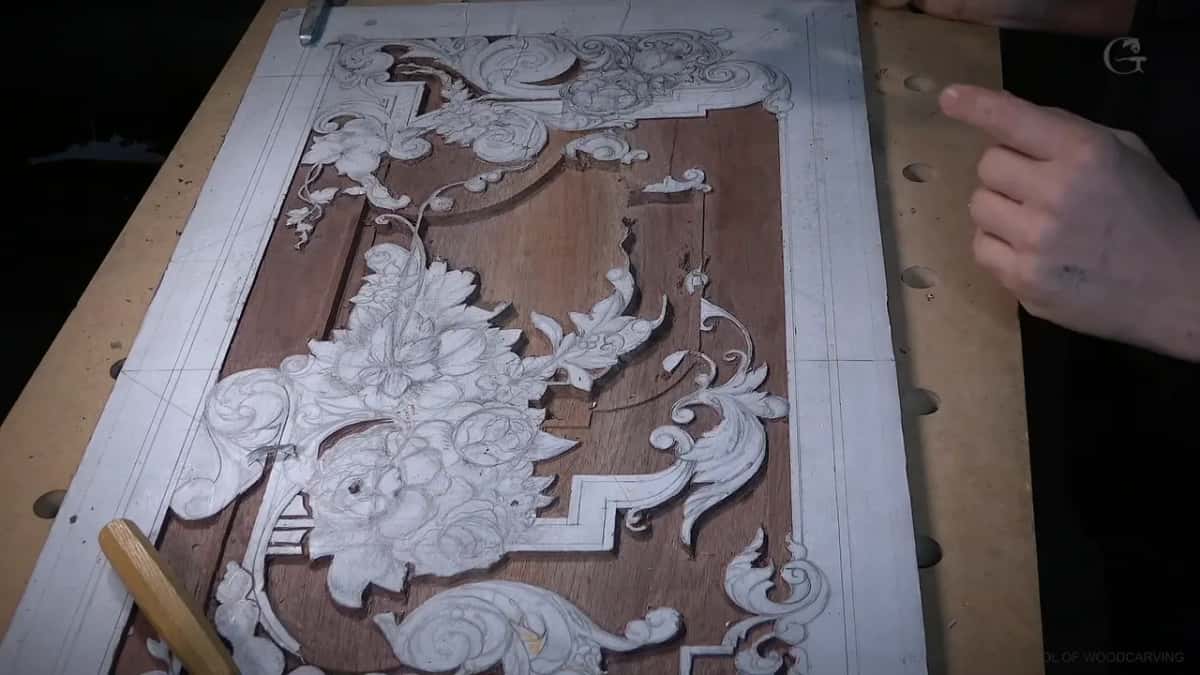
A drawing alone can't carry that. In the last design lesson I drew a little twist on the background and said I'd carve it later, if I didn't forget. The background was going to come off, and then I would not be able to see it. Lines on the ground leave with the ground. Later, carving, when I reached a spot that had to be really deep, I took a different marker and marked it down before I'd forget.
When the map was ready I said so at the start of lesson 20. It sits in the downloads section, at the beginning of the course, and I hope it helps you.
What do the colors on a relief carving depth map mean?
Three colors, three depths of ground. Light blue is 1/16 of an inch, about 1.5 or 1.6 mm. Yellow is 1/8, three millimeters. Really bright red is 3/16, five millimeters. The course page already lays out where each zone sits on the panel, so I won't walk them again here. I gave each depth both ways on camera, metric for some of you and imperial for the rest.
What a colored sheet can't show is the story behind a number. Take the light blue. That ground was first taken down to 3/32 inch, then we shaved about 1/32, and the final depth is 1/16, 1.6 millimeters. The map gives you the final figure.
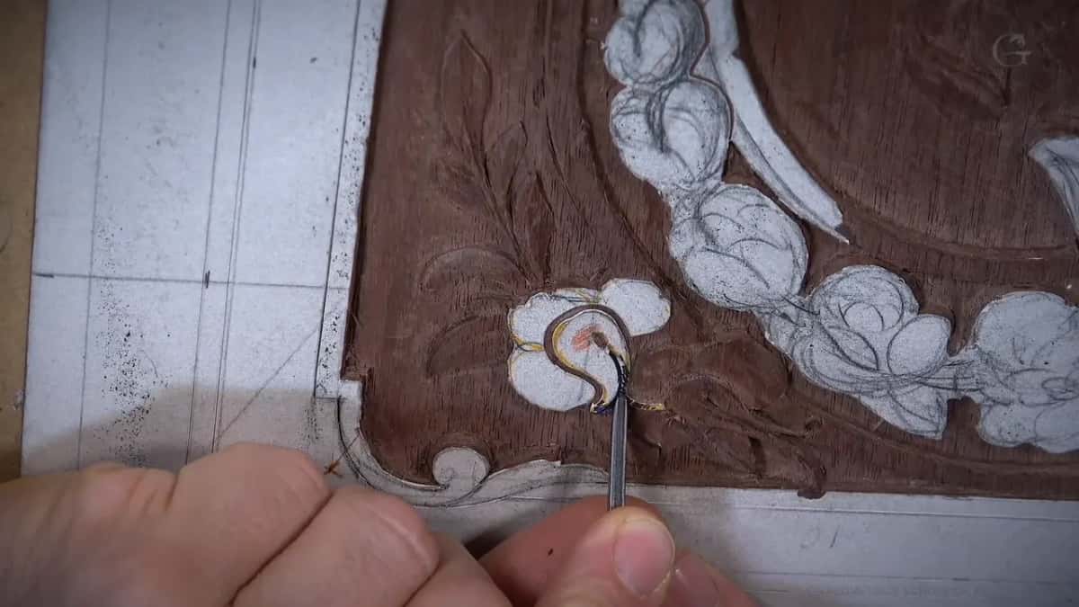
Depth also tells you what you can do on top of it. On a flower in lesson 20 I wanted some waviness in the petals, because I had a good thickness there, about one eighth of an inch, three millimeters. That thickness was my reason.
You could go deeper if you wish. I didn't. I really wanted to be authentic to the original, and that's supposed to be a really shallow design, true furniture style, nothing fake about it.
Where the drawing ends and the map takes over
What you hold | What it tells you about this panel | Which lesson | What I said about it there |
|---|---|---|---|
The pencil drawing | Where every movement goes, drawn before carving | Design lessons | I was drawing just for carving |
Charcoal and shading | Which parts sit lower; darker means concave | Lesson 14 | Concave cut, but much darker there |
The size line | Thin walnut, three eighths of an inch | Opening lesson | Only about three eighths, ten millimeters |
The depth map | How deep I went with the background | Twentieth lesson | Light blue, yellow, really bright red |
Shallow blue zones | Wood left thick so the panel holds | Part 19.2 | More removed, a lot less support |
The frame margin | Ten millimeters all around that goes inside | Second lesson | My boundary I should not cross |
Why does a thin carved panel need shallow zones?
Strength. I left the thicker areas, instead of taking everything down to an eighth, just to give the panel some strength. The more material you remove, the less support you have left.
I still wanted to see the thick parts, like supporting parts. One high part connects all the way through, and another supports the other side. Where the ground is only a sixteenth deep the panel gets a lot more strength, so it is not going to move as much. I said that in lesson 16 too.
Lesson 15 put it the other way round. Remove too much material in one spot and you create a lot weaker wood, and you create a problem. It's going to move, and it won't be as stable.
Furniture gets used. We don't want to create any weak points, I said in lesson 17, especially on a furniture panel that is going to be used, because we don't want anybody to break it. So when you see light blue on my map, read it as wood I left there for a reason.
What did old furniture makers put on the back of a thin panel?
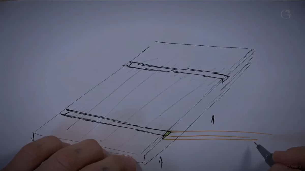
Other generations had their own fix, and you can see it sometimes in furniture. On the back, where they had not taken much material off the front, they made channels, like a dovetail channel, and slid in a second piece with its grain running perpendicular to the panel. Then they planed that piece level with the back.
To do that you need the thicker areas. That way you could take out a piece even up to about 3/32 inch from the back. I sketched it on a piece of paper for the camera, exaggerated, in 3D, with the face of the panel lying down.
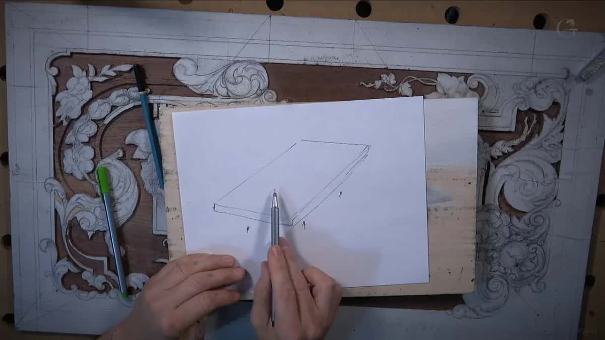
A dovetail gives you much better strength, though a straight channel on the inside still works. The piece itself can be that thin, about three thirty seconds, and still do the job, because its grain crosses the grain of the panel and just prevents too much movement.
And you may not need any of it. Put the panel in a frame with rails and stiles around it, and the rails prevent that movement. If that part doesn't make sense, I said, just ask me again in the comments. That is the same frame the drawing keeps 10 mm clear for, 3/8 of an inch all around. In the second design lesson I said that band goes inside the frame or the door, and I called it my boundary, the one I should not cross at all.
Can you print a pattern this big at home?
Print the full size, glue it on, and carve it. Those were my words the day I finished the drawing and promised to upload it.
Full size means one to one. On my flower rosette patterns I said it plainly: one inch equals one inch, one centimeter equals one centimeter. A sheet more than two feet long won't come off a letter size printer in one piece, and when I glued my own white paper on this board I said any paper will work. Normal printer paper in multiple pieces, glued on top of the board, does the job.
I sprayed photo mount glue on the wood and on the paper both, and the design course page tells that part. Then check the sheet before any steel goes in. On my lily box I printed on normal printer paper, United States standard, and European paper is a little different. So I checked each edge against the farthest points of the design and made sure the two sides were about the same, then put blue tape down to mark the position.
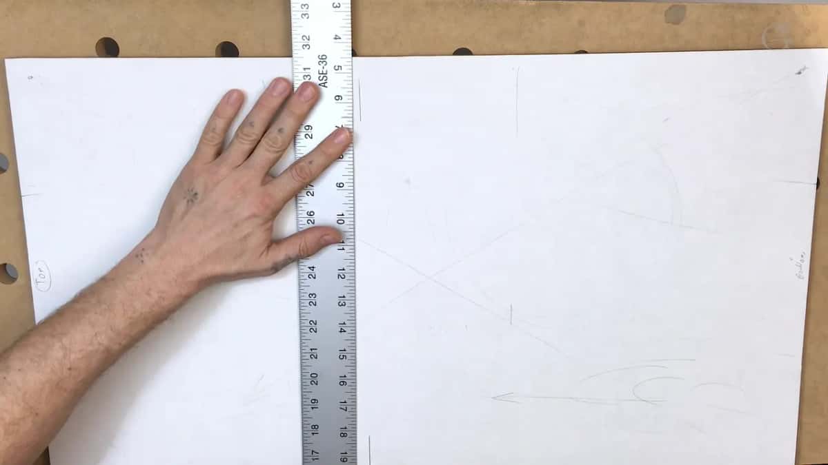
The printer still caught me there. I did not think about the boundaries of the printer, so I had to recreate my end points. It's okay. It's just paper, and I can always reprint it.
Is the line on the pattern the line you carve to?
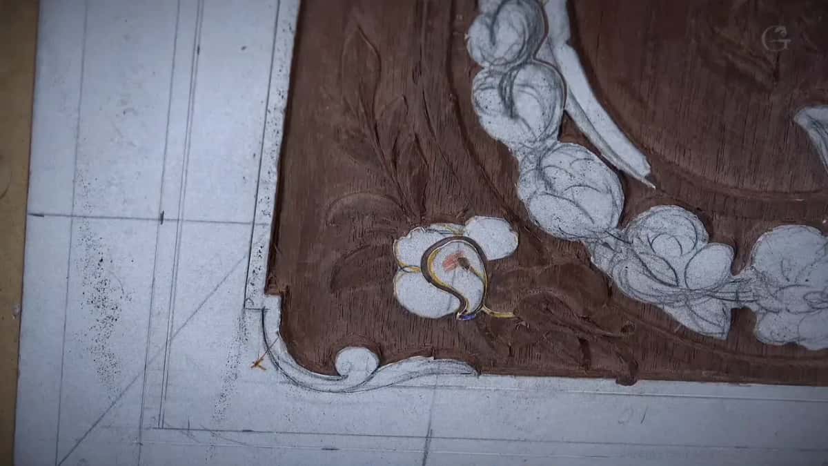
Not while the ground is coming out. Then I stay about 1/16 inch, or just 1/32, away from the final line, and I'd rather see a messy look for now than dig in too close.
Partway through lesson 17 I stopped to remind you that the line in front of me was not the final line. The final line gets decided when the background is done and we move on to the details. Then we'll know exactly where it is supposed to land.
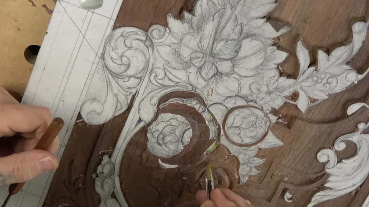
Even my pencil wasn't final everywhere. On one flower in lesson 20 I had not placed the final line when I drew it. Before the first pass I took a marker and refined the details. Then I went in with a 1 millimeter number 11, careful, careful, careful.
I still go back to the drawing, too. Working the acanthus in lesson 21 I came to one part and said I had no idea what it was, I'd have to look at my drawing and figure it out. A few lessons on, in lesson 23, I couldn't remember how a separation was supposed to go. I could imagine it and redraw it, I said. No big deal.
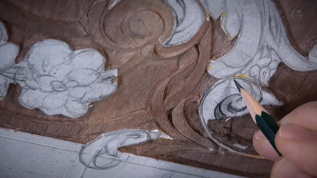
At the very end the paper comes off. Early in the next course I said mineral spirits will do it, or any alcohol, and even my fingers, or the side of a knife blade used as a scraper.
Everything in the download waits on the lesson page. How the ground came out, in what order, where the 3/32 ended at 1/16 and which deep spot I marked before I forgot, all of that is in the lessons, with me at the bench, carving by hand. If you want to carve this panel beside me, Access opens the whole course.
How it's done
- Print it one to one. Full size, one inch on paper for one inch of walnut. A panel this long takes several printer sheets.
- Glue it down and measure. Once it is on, check the gap between each edge and the farthest point of the design on that side, then compare the two. Tape marks where it sits.
- Leave the outer 10 mm alone. That 3/8 inch band disappears into the frame or the door.
- Stop short of the final line. Keep the gouge about a sixteenth, even a thirty second, away while the ground drops. Messy is fine.
- Give each zone its color's depth. Bright red goes 3/16, yellow 1/8, light blue 1/16. The shallow parts stay shallow, since they hold the board together.
- Mark a deep spot right away. A different marker, before you forget where it was.
- Settle the final line last. When the background is done and the details begin, you'll see where it lands.
Frequently asked questions
Is a hand carver's depth map the same as a CNC depth map?
Not on this panel. Mine is a drawing in three colors that shows the depth of my background, zone by zone. A CNC machine reads a gray height picture instead, and the download for this walnut panel has nothing like that in it.
What size is the furniture panel pattern?
Walnut, 3/8 by 15 1/2 by 27 1/4 inches, or 10 by 393.7 by 692.15 mm. The board is thin, so from the first lesson my plan was to go no deeper than 3/16 of an inch, five millimeters, and still get a three dimensional look.
Can you carve the background deeper than the map shows?
You could, if you wish. I kept mine shallow to stay authentic to the original, which is a really shallow design. On a board only 10 mm thick, every bit of material you remove also takes away some of the support the panel needs.
What to carve next