
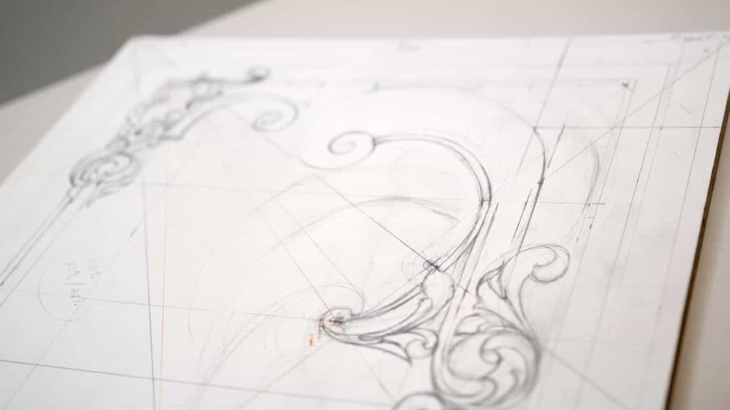
Alexander Grabovetskiy, woodcarver, School of Woodcarving · Published 2018
How much detail is too much in a carved panel?
Quick answer: Too much detail is anything that pulls the eye away from the principal movement, or anything the gouge cannot physically reach. I hit both limits on this drawing. One shape was too heavy and stole attention, another was too small to carve at all. Both got rubbed out.
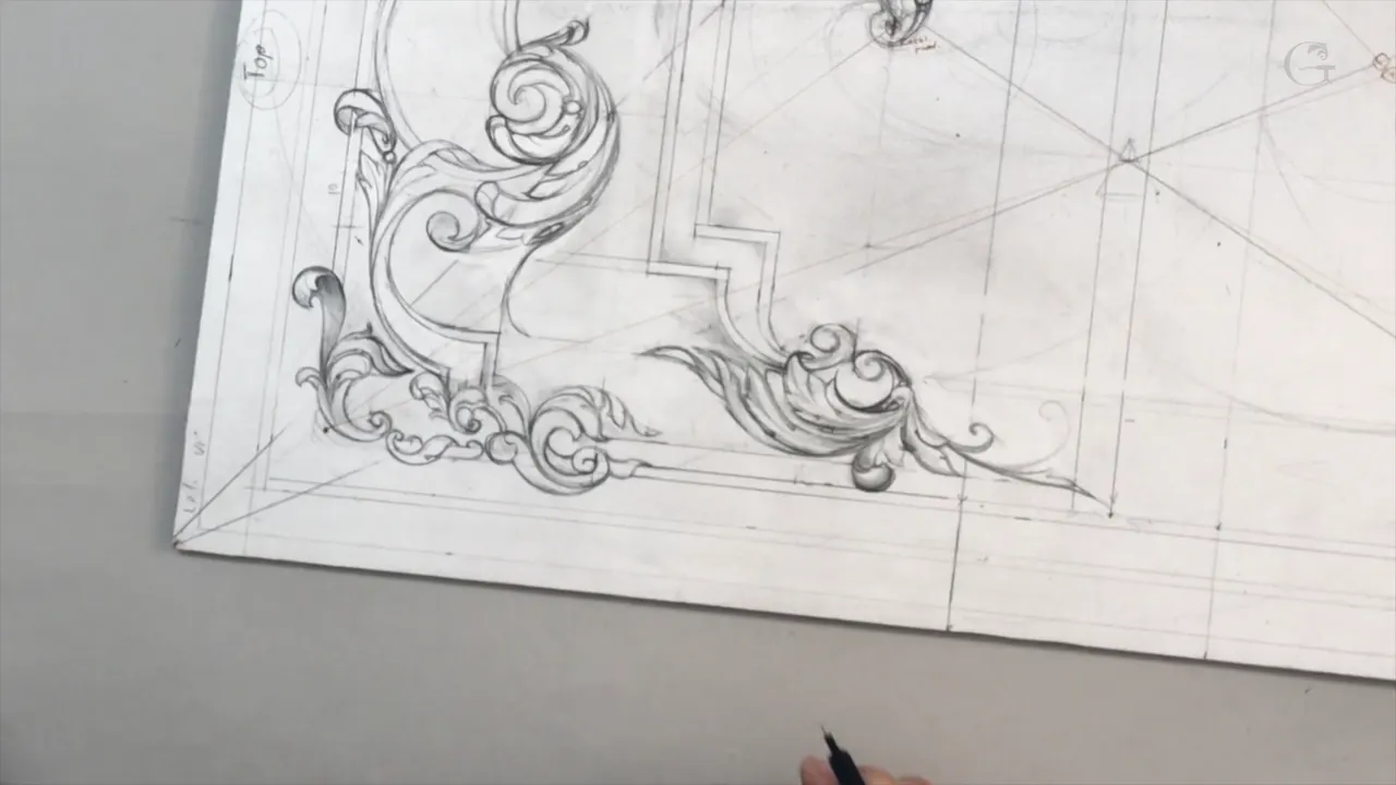
Ornament has two ceilings, and they are set by different things. First comes your eye. Whatever out-shouts the movement it was meant to serve is too much, no matter how well it is drawn. Second comes your gouge, because a shape the tool cannot physically reach is too small, whatever it looks like on paper. I hit both on this drawing.
Have you ever added one more curl to a design and felt the whole thing get worse? Or drawn a detail you were proud of and then found no way on earth to carve it? Most people meet that second limit far too late, with a chisel already in their hand, the wood spoiled and the afternoon gone.
Today is mostly me rubbing things out. Something came in heavier than it should and dragged my eye off the middle, another came in too small to carve at all, and a curl ended up so close in size to its neighbours that they started arguing. Each fix is small, and each one changes the whole panel.

What is actually being decided here
- Anything competing with the movement beside it has already overstepped, good as it may look alone.
- Anything the gouge cannot enter is too small, and that limit is physical, not aesthetic.
- Two elements of nearly the same size will fight. Shrink whichever matters less.
- Weaving an element under, over and under again buys depth for almost nothing.
- One side of a panel can be curly and the other straight, provided the division lands somewhere real.
- Patience is the actual skill. On this recording I say it out loud twice, and I meant it.
When does detail start working against you?
Detail turns against you the moment it competes. I put a shape in here, looked at it, and said plainly that it was too thick and pulling attention away from where it belonged. Nothing was wrong with the shape. It was simply louder than the thing it was supposed to serve.

Hierarchy is the problem there, not drawing, and the test for it is quick. Cover the element with your thumb and look again. Improvement means it was competing. Should the panel go slack instead of better, put the element back and go hunting for the fault somewhere else entirely.

Twice in this hour, in two different corners, I say too much. Both times the shape came out, and both times the corner got better. Adding is easy and it feels like progress. Taking away feels like losing work, which is exactly why most panels end up crowded.
What does the other limit feel like?
Small enough that the tool will not fit. I drew a passage of fine internal detail, looked at it, and said no, too small, it is going to be hard to carve. On paper it read beautifully. In basswood at this depth it would have been a smear.

Every gouge has a width. Nothing you draw can be finer than the narrowest one you own, and below that width the tool stops carving and starts scratching, which reads as damage, not ornament. Measure the smallest chisel in your own rack before designing against it. A carver who draws past the tooling is drawing a picture, not a carving.
Here is how the two ceilings show up on a sheet, and what each one actually costs.
| The fault | How it shows on the drawing | What sets it | What it costs you to ignore it |
|---|---|---|---|
| Too thick | One element louder than everything around it | Your eye | Two centres, so the panel reads as having none |
| Too small | Lines drawn finer than the narrowest gouge you own | The tool | Hours lost, and then a smear |
| Same size twice | Two curls within a hair of each other | Your judgement | They argue with one another |
| Reads flat | Something sitting flat on the surface | The light | Nothing turns anywhere, because no shadow gathers on it |
| Empty area | A stretch with no incident at all | Your own eye | Attention leaves the panel and never comes back |
How do you stop two elements from competing with each other?
Change one size. My curl was too close to the size of the shapes beside it and the group did not feel good, so I made the curl smaller and the argument stopped. Nothing moved. Nothing was deleted. Just one of them got a different scale.

The same law works the other way round and it is the one I lean on constantly. When two things are near-identical the eye cannot rank them, so it keeps flicking between the pair instead of travelling through the composition. Difference is what lets an eye move. The same reasoning drives the sizes in the crowded corner I redrew a lesson ago.
Adding that curl cost me something else, and I said so while drawing it. Once a movement exists in one place it has to exist somewhere else too, or the panel looks lopsided. I was happy to pay that price, but it should be a decision, not a surprise.
Does more detail always make it more beautiful?
Both things are true and they are not the same thing. On camera I say that the more details like that I add, the more beautiful it is going to look, and in the same hour I deleted several elements for being too much. Those are not contradictions. Two different kinds of detail are at work.

Detail set down beside an existing element will compete with it. Put that same detail inside the element instead and it enriches. Subdivide a lobe you already committed to and the leaf gets richer without gaining any area at all, which is the move that made the Corinthian leaf the shape it is.
Put a new shape next to the old one and you have two claims on the same attention. Which is why a Baroque cartouche can carry a hundred incidents and still read calmly, while an amateur panel with twenty gets noisy. The hundred are nested. The twenty are side by side.
Either way it costs something, and I want to be straight about that. Every element I add commits me to balancing it somewhere else, so a design gets harder to finish with every good idea. I am fine with that. I just refuse to pretend the bill does not arrive.
What do you do when nothing you try works?
Stop, and say so. Somewhere in this recording I admit to a blank moment, where I genuinely did not know what the next thing should be. A return went in, came out, and went back in differently. Maybe yes, maybe no, and then no.

The temptation at that point is to accept whatever is on the paper because you are tired of the problem. Resist it. Whatever you settled for at nine at night is what you will be looking at in somebody's dining room for the rest of your life, and lime does not forgive.
What usually breaks the jam is connecting the new thing back to something that already exists. Rather than inventing a fresh shape I take the stuck element and run it into the main movement, and about half the time the corner resolves itself. The other half I sleep on.

Look at a run of period panels in a museum collection and you can see the same hesitations frozen in the wood. Somebody solved that corner at the bench too, and the ones who solved it well were not faster than us. They just had more chances.
Why weave one element behind another?
One element passing behind a second and reappearing on the far side tells a viewer that two real depths exist. On this panel I took one element underneath, brought it up over the next, then sent it back underneath again. Three crossings, one line, and the corner stopped looking printed on.

Old carvers used this constantly. Interlace runs through Celtic stonework and on into Chippendale fretwork, and it works because the brain reads interruption as distance. You are not carving depth here, only the evidence of it.

Proof comes from the shadow afterwards. I pencilled some in just to test the idea before committing, which takes a moment and saves a great deal more. A drawing without shade proves the shapes are right and proves nothing at all about whether the relief will read.

Can one side of a panel be busier than the other?
Deliberately, on this board. One half carries the curly work, the flowers and the movements. The other half stays straight. What keeps it whole, instead of looking half finished, is where the two meet, because that division lands on the golden ratio of the inner panel.

A split placed by eye would have read as indecision. Put it on a line I set out back in the lesson on root rectangles and it reads as a choice, even to somebody who has no idea the line is there. Asymmetry needs a reason, and geometry is the cheapest reason available.

I stopped the molding short for the same purpose. Rather than running it the full length I brought it to the golden line and left it, which turns a border into a separate element instead of a frame. Five millimetres, 3/16 of an inch, decides that. The molding width has not changed since the first lesson and it is not going to.

What are the invisible lines actually for?
Aiming. Running through this corner is a line that will never appear in the finished carving, and I brought an acanthus tip to it anyway. I said out loud that I still have that invisible line and I am going to hit that line, because hitting it is what makes the surface feel settled.

Nobody looking at the panel will be able to name what is holding it together. They will only notice when it is missing. Exactly the point of the invisible T-stop, and it holds for every construction line on the board.
The eye and the pipe go on the centre line for the same reason. Put an eye off its line and the acanthus lobe looks sprained. Put it on, and the lobe turns the way a real leaf turns, which is the entire difference between ornament and decoration.

How long should a drawing like this take?
Longer than you want. Plainly, while filming: this takes patience, just lots of patience to develop something looking good, and I meant that as a warning, not encouragement. This drawing alone is now ten sessions deep and no gouge has been sharpened yet.
People skip this stage and then wonder why their carving looks like somebody else's carving. No shortcut exists in the ornament trade. You can copy a drawing from a book and produce something competent, and a competent copy is exactly as far as it goes.
I finished this session unhappy with one section and said I would sleep on it. Not a failure of nerve, either. A passage that refuses on a Tuesday often solves itself by Thursday, and the alternative is forcing it and carving your bad mood into somebody's furniture for the next two hundred years.
Why show the thinking and not the finished sheet?
What I run here is not really a school at all. It is closer to a virtual apprenticeship. I work, you watch, you pick up what you like, and you develop your own style and your own way of working out of what you saw.
I could have drawn all of this before the camera came on and handed over a clean sheet. Plenty of courses do. You would learn what a finished design looks like and nothing whatsoever about how one gets made, and the second thing is the only part that transfers to your own board.
So you get the erasing too. If you dislike my way of thinking I will understand, but stay patient and watch what the end result turns into. That offer is open on every course in the library, and that is what the tuition buys. The panel itself goes on to the carving stage, the next lesson takes up the bottom half of the board, and the whole sequence lives in this design workshop.
One habit worth stealing before you close this. I stay away from the board for a couple of seconds at a time and just see how it all feels, and I do it constantly, not once at the end. Close up you judge a curve by its last half inch. From a step back you judge the whole panel, and the two verdicts disagree far more often than anybody expects. A modern acanthus reads differently at arm's length for exactly that reason.
So: would you rather own a drawing, or know how to make one? Shall we carve?
How it's done
- Draw it, then cover it. Put your thumb over the element you are unsure about. When the panel improves without it, the element was competing, not contributing.
- Measure your narrowest gouge. Whatever that width is, it is the floor for the whole drawing. Anything finer will scratch instead of carve, and a scratch reads as damage.
- Break a size tie. Two shapes of nearly equal size argue with each other. Shrink one and the pair immediately gains an order the eye can follow.
- Weave, do not stack. Send one element under the next, up over it, and under again. Three crossings of a single line buy real depth for almost no drawing.
- Pencil a shadow in. Lay tone under the shapes before committing. A drawing without shade tells you the outlines are right and never tells you the relief will read.
- Put the division somewhere real. A busy half and a quiet half work only when the boundary lands on a line you already set out. Placed by eye it reads as indecision.
- Stop and sleep on it. When a passage refuses on the day, leave it. Forcing a shape you dislike carves your bad mood into the finished piece permanently.
Frequently asked questions
What makes a detail too much?
Competition, not quantity. When one shape shouts louder than the movement it sits in, it has to go, whatever its quality, and covering it with a thumb will tell you in a second.
How small can ornament get before it stops working?
Narrower than your smallest gouge is the hard floor. Below that width the tool scratches and stops carving, and what looked like fine detail on paper turns into a smear in lime.
Why do two similar shapes look wrong together?
Equal sizes give the eye nothing to rank, so it flicks between them instead of travelling through the composition. Changing one size fixes the whole group without moving anything.
What to carve next