
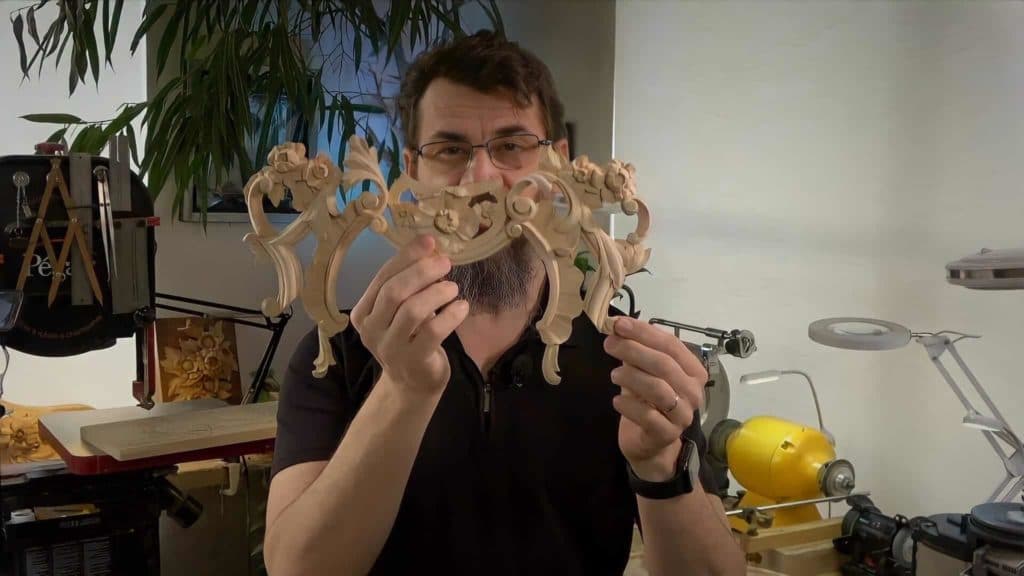
Alexander Grabovetskiy, woodcarver, School of Woodcarving · Published 2022
What does a photograph of a finished wood carving actually show?
Quick answer: Carving photographs report on shadow before anything else. A single frame gives away a curve that went flat, a ground that never got level, an undercut too shallow to throw a dark line, and which member sits highest at a crossing. Tool marks come through as well.
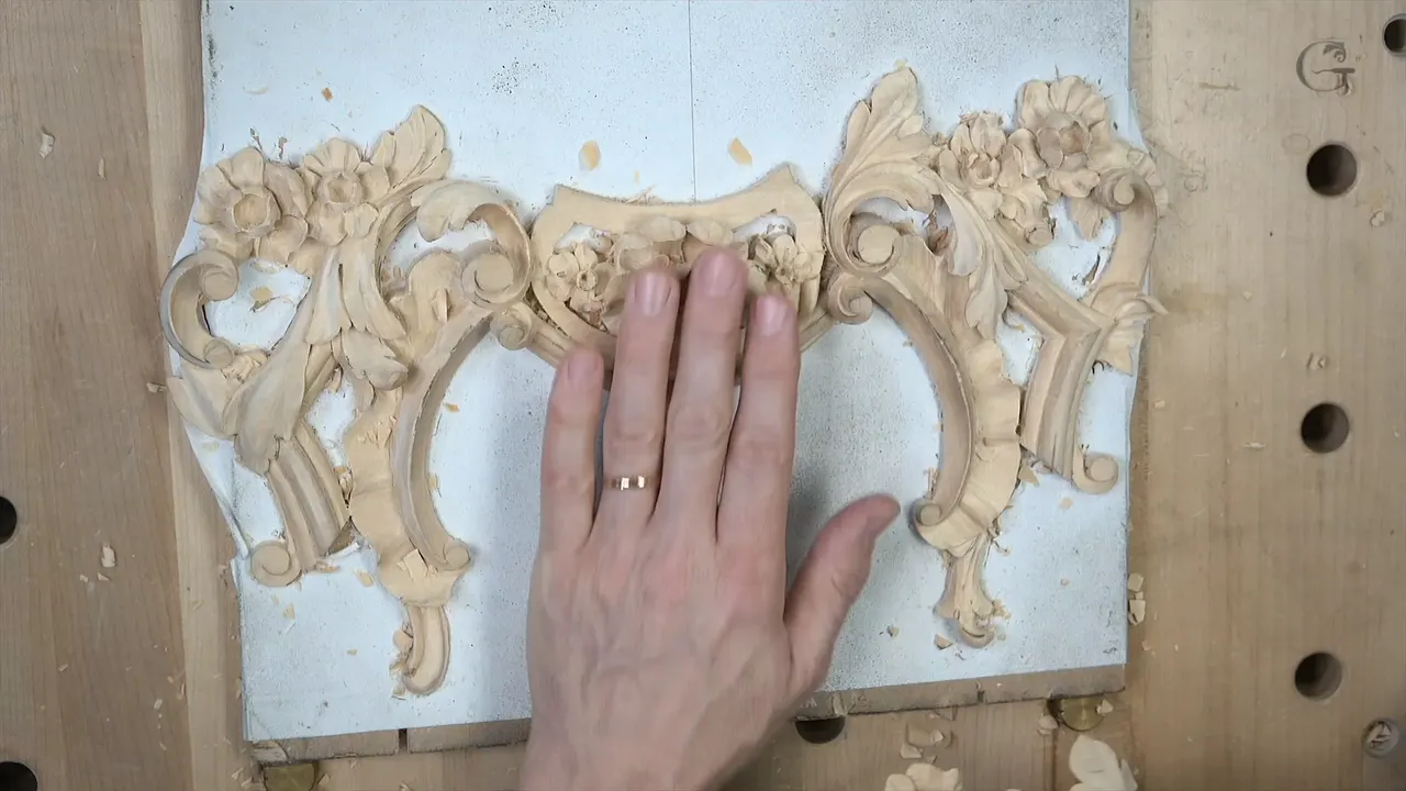
A photograph of a finished carving is a shadow test first and a picture second. One still frame carries almost everything that decides whether relief reads: a curve that stayed a curve, a ground that sits level, an undercut deep enough to throw a dark line, and a ridge standing highest where two members cross. Light does the rest.
Ever finished a piece, been pleased with it on the bench, and then seen the photo look flat? Ever wondered why a carving that felt three dimensional in your hands goes dead in a picture? The camera is not lying to you. It is showing you what a viewer across a room already sees.

This is the last node of the course, the one where you upload a photo of your work, after the last lesson. Below is what that single picture actually reveals, taken from the faults I name on camera across all fourteen lessons.

What a single still frame gives away
- Straight lines where curves belong. Nothing hides worse in a photograph than a flat edge.
- A curl rolled too far, which stops reading as a roll and reads as a line.
- A ground that is not level. Raking light turns every high spot into a smear.
- Shadows, or the absence of them, since undercutting either casts one or it does not.
- Which member sits on top at a crossing, because a photo settles that argument instantly.
- Torn grain. Any dull tool leaves a trail behind it, and the trail photographs.
What are you actually sending a picture of?
One detail out of a real commission, as it happens. The piece in this course belongs to a Venetian style room in the older manner, and I carve two of them, mirrored, with the second one filmed for you across fourteen lessons. So it is a production job, not a plaque made for a lesson.

The composition is floral ornament and acanthus movement riding right on top of a molding, with volutes, a shell and small leaves. The molding is a clover, convex and convex and convex again. Everything else in the piece has to sit against that profile without fighting it.

One thing surprises people. The two halves look symmetrical and are absolutely not. One movement differs from the other, and that difference is what creates the beauty. I even reverse a detail between the two pieces on purpose, so that anyone looking closely knows a machine did not make them.

How do you send it?
Run the file through tinyPNG first, then upload a jpg or a png. No zip files. Reduce the size before it goes up, because there are a lot of students and a lot of submissions, and a full size picture slows my server for everybody.
Fairness is the reason I ask. Students here come from all over the world and not everyone has the greatest internet, so one heavy upload costs someone else their page load. Twenty pictures are not wanted either. All I need is just the one picture, and I can take a look.

Have the photo ready before you open the page. New here and wondering where any of this begins? Start there. You get one chance while you are on it, and the upload button disappears once you leave.
Does a straight line really show in a photograph?
Straight lines show up hard in a photograph, and I do not like them anywhere. A transition should climb smoothly, not rise like a ruled edge, and that holds even when you look at the piece from the side. Leave a petal edge straight and it will not look natural. It will not look nice either.
The same goes for a separation cut between two leaves. Make it wavy. A flower centre left perfectly round has the same problem, because nothing in a plant is that tidy. Outlines need not be perfect, and the work is honestly better when they are not.
A camera flattens everything into two dimensions, which is exactly why a lazy line stands out there. In the wood, with your eye moving, you forgive it. In a still picture you cannot.

What happens when a curl is rolled too far?
Roll it past a certain point and you lose the feel entirely. Look straight at a curl that went too far and all you see is a straight line, which is the very thing you were trying to avoid. The point of the curl stops being visible.
So I stop short on purpose. Not all the way round, never quite closed, and the eye keeps reading it as a roll. Same rule on both halves of the piece, and I say it out loud twice in this course because it catches people.

What one picture shows and what it hides
| What the camera does | The reason | What you can do about it |
|---|---|---|
| Flattens depth | Two dimensions instead of three, so only shadow carries relief | Light it from one side and let the undercuts talk |
| Exposes a flat spot | An edge that stopped curving reads as a ruled line once movement is gone | Stop the roll earlier |
| Shows every tool trail | A dull edge crushes fibers instead of slicing them cleanly | Sharpen until the cut comes up shiny and leaves no trail behind it |
| Hides the back and any thin wall | Only one face ever appears | Judge those with your fingers and a straightedge rather than a lens |
In what order does a carving actually get made?
Three stages, and they never swap places. Bosting first, which means getting the three dimensional form roughed in with no details at all. Carving second, where the shapes get their real profiles. Cleanup last. Rush a detail into the bosting stage and you will carve it twice, then lose it when the form around it drops.
Inside each stage a direction applies. Outside inward, working from the edge of a form toward its centre, because the wood you are about to remove supports the wood you just shaped. Reverse that and you break things. I broke a petal in this course doing exactly the kind of thing that rule prevents.
Sequence matters down at the smallest scale too. At the centre of the second flower I drill first and shape afterwards, because the drilled hole gives every later cut a place to end. Do it the other way and you have nowhere clean to run to. This habit starts in our beginner course, right at the first block.
Does the background have to be dead flat?
Dead flat, and a photograph is merciless about it. I take the ground down to the molding height with a number 9 and a number 7, then bring in a router plane to make it genuinely level. Front and back end up identical, which matters because this piece glues onto a panel.

Depth gets measured, not guessed. Calipers taken off the first finished piece give me the molding width. For depth I use a pointing machine, and where I need a number I trust I drill a small hole to the exact depth and sink the needle into it. A drilled hole cannot drift the way an eye can.
A cleanly routed ground beside a raised molding is one of the few things in relief carving where one right answer exists. Level or not level. Nothing to argue about, and the camera will say which it is.

Which member should be highest where two cross?
The one in front, and it must stand clearly higher than everything around it. An intersection line cannot sit level with its neighbour or run underneath, because then nothing tells a viewer which piece passes over which. Every time you have a pipe, that intersection has to be higher, much higher than the rest of the leaf.
A pipe left flat is the related fault. I want a real convex there, an exaggerated one, otherwise the whole detail looks dull and stops reading as three dimensional. Two concave cuts either side raise the ridge between them, and that ridge is the pipe.

A leaf also has to look as though it grows from underneath. That feel comes from the height order, and a photograph reports the height order with complete honesty. If the picture leaves you guessing which leaf is on top, so does the carving.

Is the undercut deep enough to cast a shadow?
Shadow is the whole purpose of undercutting, and I do it even on volutes and on flat panels because the piece simply looks better with it. A shallow undercut photographs as a grey line where a proper one gives you black.

Where you undercut matters as much as how deep. Setting in, the tool goes straight down at 90 degrees, no leaning either way, and slicing round without undercutting at that stage. Lean the tool inward there and you have made a big mistake. I caught myself doing it on camera in lesson eight.
Under a pipe is another wrong place, because an undercut there stops looking natural. A softer undercut also throws a better shadow than a hard sharp one, which surprises people who expect the opposite. One hard floor applies to all of it. Go all the way through and the piece can never be glued to the panel. I leave a millimeter and a half, a sixteenth of an inch. If you want the tools that do this work, our tools course covers them.

Can a photograph show a dull tool?
Every time. A sharp tool leaves a surface so shiny you can still read the grain through the cut, and it leaves no trail. A dull one rubs, drags, and fills the cut with marks, and on end grain even the colour of the wood changes between the two.
Tear out is the symptom everybody recognises. Catch the grain once with a blunt edge and you get frustrated, and the frustration shows up in the next three cuts as well. It has to be really sharp, almost like a surgeon's knife. Our sharpening course exists for exactly this.
One more fault, and teaching in person is where I see it most: people push the tool instead of slicing with it. Push and the finish cut never looks as good, and you tire out far quicker. A slice photographs beautifully. A push does not.

Why does the piece in these videos look rougher than that?
Honest answer, and it matters for your own work. This particular carving is going to be painted, and not with a penetrating finish either, with chalk paint. So parts of what you saw were left rough on purpose, because paint covers them.
Carve the same thing for furniture that will never be painted and I would spend longer on it. That is the higher standard, and it is the one your photograph will be showing, since almost nobody paints their course piece. Judge yourself against the unpainted bar, not against my painted one.

Ready to work at that level with someone watching your photographs? Come and carve with us.
Are tool facets a fault?
Facets are not a fault, and I want to be clear because carvers worry about this. In places I leave them deliberately. A faceted surface catches light in small breaks rather than one broad sweep, and on an acanthus leaf that liveliness is worth having.
What a facet must not be is an accident you could not control. There is a difference between a surface left faceted on purpose and a surface you could not get smooth. Both photograph, and the second one looks like what it is.
I also mark my work up in colour while carving, red for the convex parts and blue for the concave. That map goes straight onto the wood. Nobody sees it in the end, and without it I would lose track of which way a surface is meant to run, which is the same reason I use a golden ratio centre line down an acanthus leaf. The rosette course uses that line too, and our guide to carving woods uses it for reading a board.
What if your piece is not perfect?
Mine is not either, and the footage proves it. I pressed too hard on a petal in lesson seven and broke it, said so on camera, and named the reason, which was rushing. I chipped a detail in lesson twelve through being careless. Neither one mattered much, and both stayed in the video.
Perfect is not the target anyway. Outlines are better when they are not perfect, and a petal wants waviness rather than a clean arc. A piece with an honest wobble usually has more life in it.
My goal is to teach technique and an approach to carving, my way, which is not the only way. Ask questions under the video rather than by email and I will answer them. The same habits run through our Corinthian acanthus and Roman acanthus courses, and back through the whole of this one.
Upload one good picture of the piece you actually made. Not the piece you meant to make, and not twenty angles hoping one of them flatters it.
How it's done
- Finish the cleanup stage first. Bosting, carving, cleanup, in that order and never swapped. A photo taken mid stage shows a piece mid stage, and no amount of light will hide it.
- Lay a straightedge on the ground. The background either sits level or it does not. Raking light across an uneven ground turns every high spot into a smear, so fix it with the router plane before the camera comes out.
- Look at the piece from the side. Flat spots in a curve hide from directly above and appear at once from a low angle. Turn the work and check every roll before you decide it is done.
- Put one lamp on it. Light from a single side. Undercuts either cast a dark line or they do not, and that one test settles more questions than an hour of staring.
- Take one photograph. One angle that carries the whole piece. Twenty pictures of the same carving take twenty times as long to look at and say nothing extra.
- Shrink the file. Run it through tinyPNG, then save as jpg or png. No zip files. A full size photo slows the server for every other student waiting on a page.
- Upload while the page is open. One chance during that visit. Leave the page and the upload button goes with you, so have the picture ready beforehand.
Frequently asked questions
How many photos of your carving should you upload?
Just one, and one is genuinely enough to judge from. Extra angles of the same piece cost time on a server shared by students all over the world, some of them on slow connections. Pick the angle that carries the most of the work.
What file types work for the upload?
Jpg and png, nothing else, and zip files fail outright. Shrinking the image through tinyPNG before it goes up keeps the page quick for everybody, which matters more than it sounds when submissions arrive from every continent.
Can you come back later and upload the photo?
Leave the page and the button leaves with it, so prepare the file first. One visit, one upload, and nothing about that is designed to catch anybody out. Having the photo sized and ready beforehand solves it completely.
What to carve next