
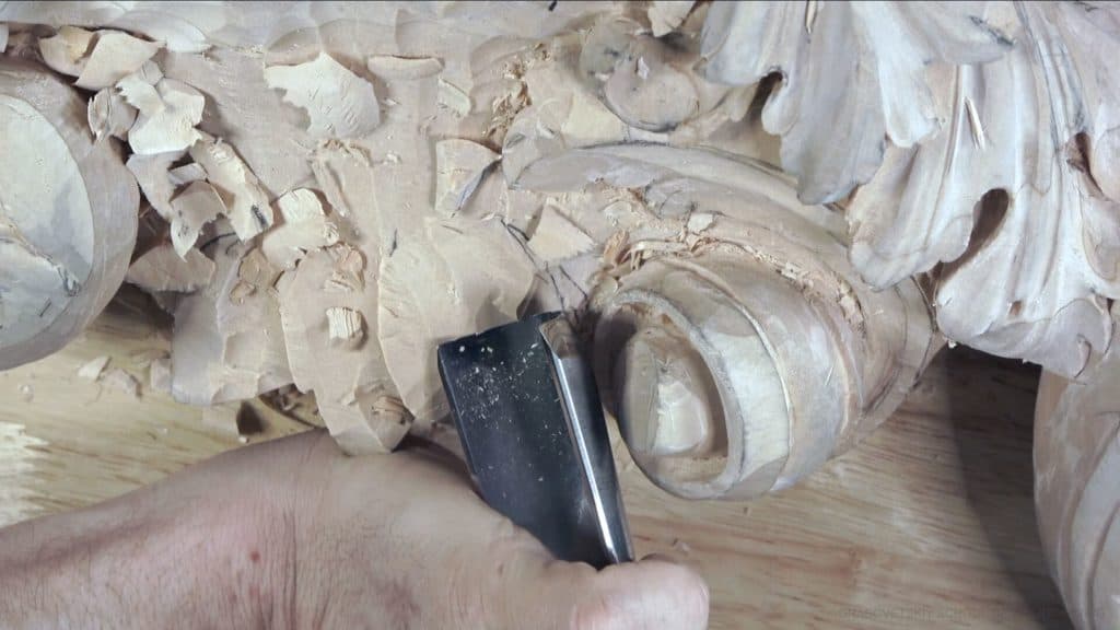
Alexander Grabovetskiy, woodcarver, School of Woodcarving · Published 2020
How do you carve an S curve on an acanthus leaf?
Quick answer: An S curve on an acanthus leaf is one line shaped like the letter S, turning one direction and then the opposite. On this Venice ceiling I planned one before any division, chopped its point with a #5, rounded a too-pointy tip with a #7 and carved small ones in two passes, flipping the #5.
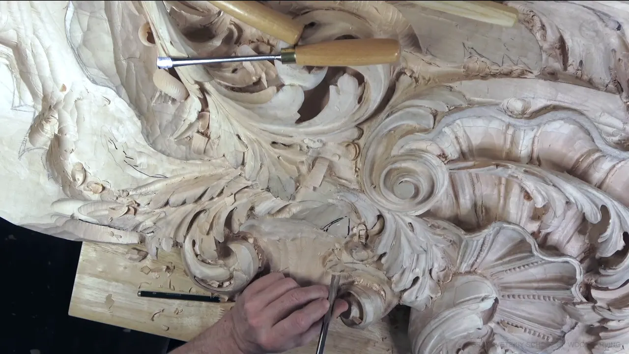
The S on an acanthus leaf is a movement that bends one way and then comes back the other way, like the letter. I planned a big one at the very start of workshop 47 on this Venice ceiling, before a single division inside it, and I set it right away. A #5 gouge chopped its point. Then a #7 made the whole letter nicer. Later in that workshop the little S shapes inside the leaf went in, carved with a small #11 veiner and a #5.
Can you write a capital S on a scrap of paper? And a smaller one right under it? Then you already know the shape. What you still need is the order of the cuts, and I can give you that, tool by tool, the way it went on this panel. I'll also tell you about the one cut I tried to skip, and why I went back to it.
What this S needed on the ceiling
I planned the S as a movement before a single division was carved.
A #5 chopped the point.
The #7 went over the big S to make it nicer, and then came a slight shaving that was more or less the final one.
The small ones started as grooves from a little veiner.
For the letter itself, one pass of the #5, a flip, and a second pass the other way.
One separation went a little closer to the next, for a curlier look and to match the rest.
I almost skipped the preliminary cut on a small S, and then made it.

What is the letter S on an acanthus leaf?
Any movement that bends one way and then turns back, on this panel. Across the ornament of this ceiling it shows up at two sizes. The big one is the shape of a whole section of the leaf, planned in the first minute of workshop 47 and divided later. The small ones are separations inside the leaf, carved in the last parts of the workshop, where the leaf begins to curl.
Which way the two ends of an S should run is a rule I gave in part 3 of this room, so I'll leave it there. The English painter William Hogarth gave a line like this its own name, the line of beauty, in a 1753 book called The Analysis of Beauty. His idea was that a line like that looks lively, where a straight one looks dead. I just call it the letter S, the same as I do on camera.
A long flowing curve that bends only one way is a different job, and I carved one of those back in workshop 17.
When does the S go into the wood?
Early, before the divisions inside it. Workshop 47 opens with me saying, let me see, it has to go this way. Then I showed the camera where everything would sit. One eye right here, another eye over there, a section that would go underneath, and a really nice pronounced S shape that I would divide later. There would still be divisions. More divisions, I should say.
The eyes came first, with a 3 mm (1/8 in) #11 that turned out too big for the spot, so I went down to 2 mm (5/64 in). There was good room for the pipe, too.

About five minutes in, I wasn't sure I liked one piece, and I made the letter S shape right away anyway. A couple of minutes later I showed the camera where its point would face and called it a really pronounced letter S, a really nice movement. I call shapes like this movements, and workshop 38 is where I talk about that word.
Right after the S went in, I called it a really nice element and then corrected myself. Nice development, I should say. I do that a lot in this workshop.
Later, with the #7 in my hand, I said I'm not going to change it, and then I said it again. From there all it needed was clean up, and clean up, and clean up.

Which gouge chops the point of the S?
The right one for it, and on this leaf that was a #5. I needed the right tool, so I picked up the #5, chopped, and said beautiful. Underneath it another element was growing, and taking the #5 to that straight away would have been a mistake. I had to separate it first and develop it after.
Something I did in that same corner came out no bueno, my words. It wasn't that bad, either.
What do you do when the tip comes out too pointy?
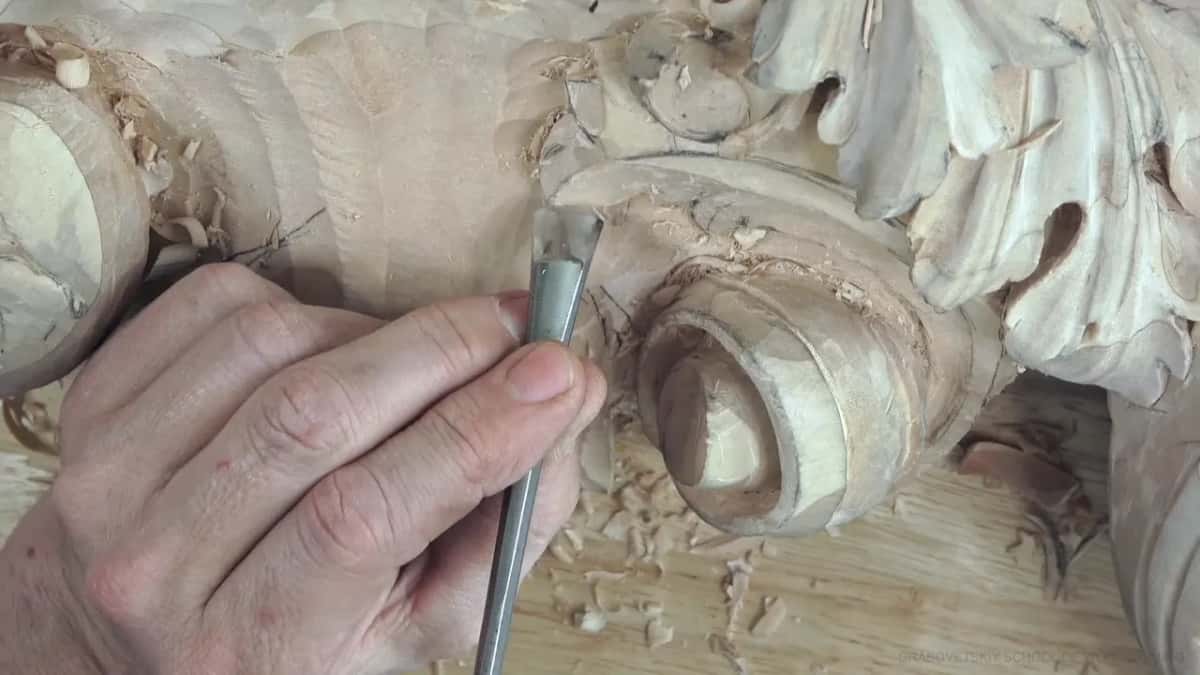
I rounded mine with a #7. One of the small ones late in the workshop, which I'd just said would look really cool, came out a little too pointy for my taste. The #7 went in and brought that movement to a nicer shape, going up.
The big S got the same gouge earlier, to make the whole letter a lot nicer, and then a slight shaving. More or less the final shaving, I said. I did the same with the #7 in the next spot, cleaned it with the #11 again, and pointed out how nicely it was developing.

One spot I left alone. During the eighth part a piece came out sharper than I liked, and I said it's okay, it's still okay, and went on.
Which ridges stay when you carve the S?
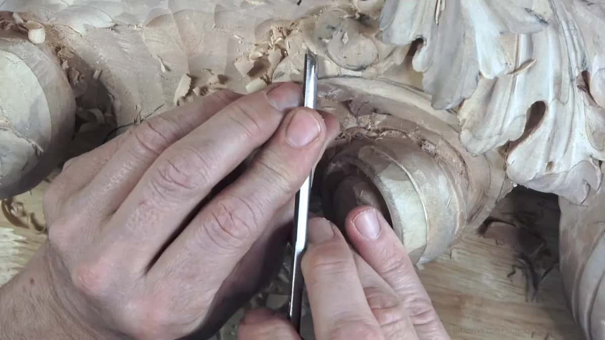
The ones I needed, on this leaf. Right after the big S, I made a small concave inside with a #5 a quarter inch (6 mm) wide, and I still kept that ridge, because I really needed it. When I carved the little separation later, I said I didn't want to lose the ridge beside it either.
Some ridges go. In the third part one was too pronounced for me, and I took it out slightly. In another spot I thought I could go lower and make one division higher than the ridge next to it. That would look really good, I said, and then I took it down a notch. It should look good, I should say.
Which tool outlines the small S shapes?
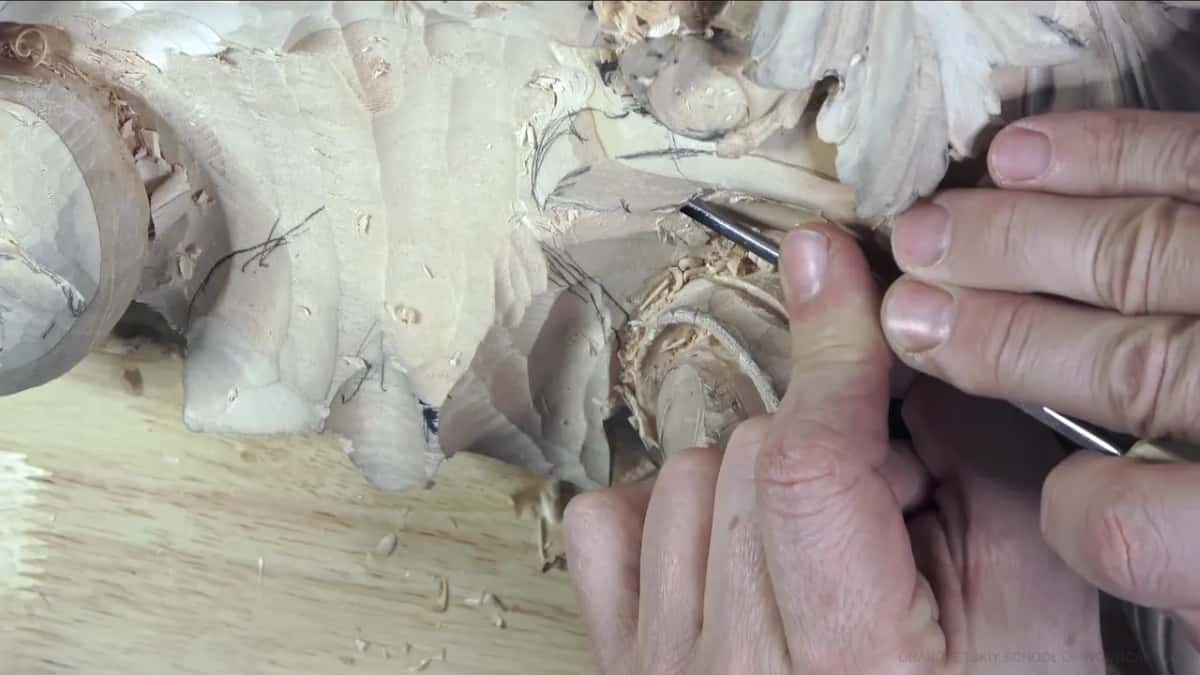
A little #11 veiner. Once the dark spots were in, the next step was small separations, as I put it. Before that, a bit of wood in the spot needed chopping down. Then the first eleven I picked up for the separation was too big, so I went to a smaller one. That little separation was almost impossible to see on camera, and I said so.
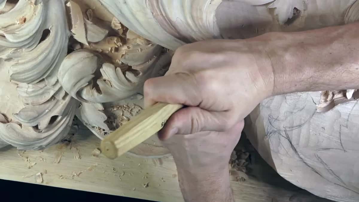
Another separation, in the last part, went in with a 2 mm #11, about 5/64 of an inch, and I said the size three times over. I don't use a V tool anywhere on this ceiling, so the veiner does that job here.
What makes the second half of the S?
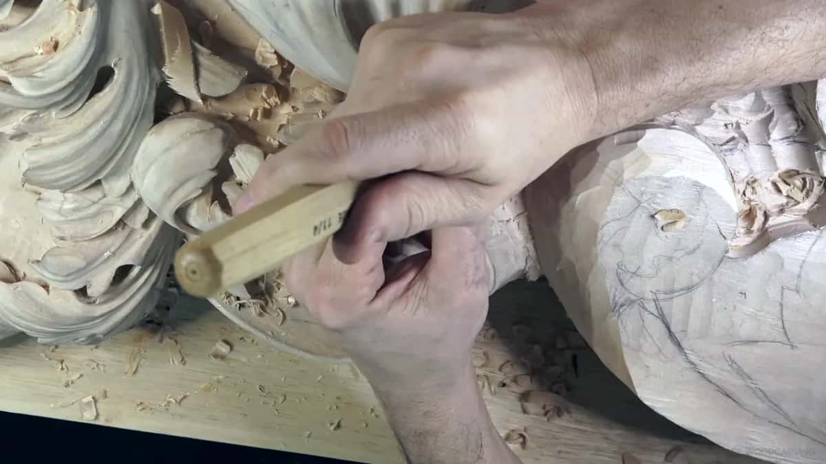
The same #5, flipped. For the letter itself I switched to that smaller tool, made my first pass, flipped it, and went the other direction, and there it was, a really beautiful letter S. Flipping a gouge is a trick with its own lesson, workshop 40. Probably you can see that now, I said to whoever was watching.

There was another way. I could have left that separation just moving inward, the way it follows the natural movement in some designs. Here I didn't need it. I knew it didn't look clean yet, and I told the camera it doesn't have to. Both passes are on camera in workshop 47, and the tuition opens every part of it.
The S, gouge by gouge
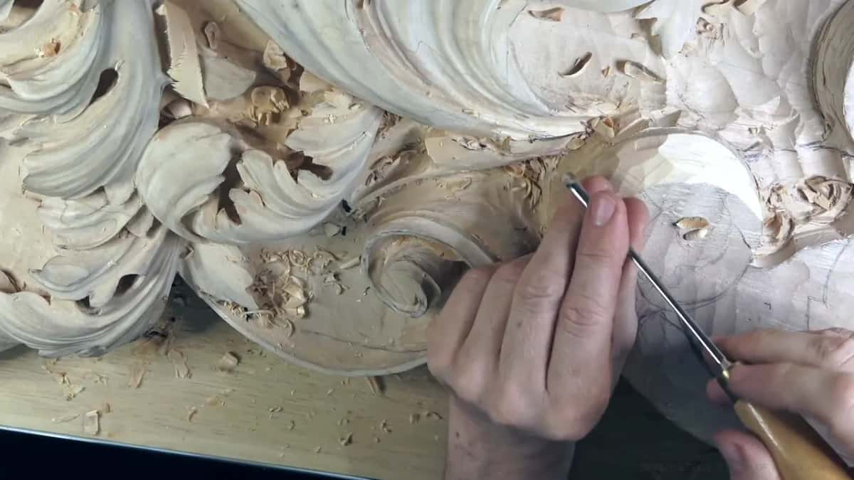
Here are the tools I named for the S in workshop 47, in the order they came out.
| Tool | Job | Result |
|---|---|---|
| #5 gouge | Chopped the point at the end of the big S | A point I called beautiful |
| Then the #7 | Went over the big S to make that letter much nicer | Close to a final shaving |
| Small #11 veiner | Outlined a little separation so small it was almost impossible to see | Groove beside a ridge I kept |
| #7 once more | Rounded a small S whose tip had gone too pointy | Nicer shape, going up |
| #5, flipped between passes | One pass one way, then the other direction for the letter | Really beautiful letter S |
| 2 mm (5/64 in) #11 | Carved a separation near the end, where the leaf got curly | More care from there |
How pronounced should the S be?
Clear enough to read as the letter, on this leaf. I called my first one really pronounced. Later, when I had to repeat a division, I said the new S had to be more pronounced, and that's how I carved it.
Repeating a shape like that is a habit I talk about in workshop 41. Here it was one division done again, a little stronger than the first.
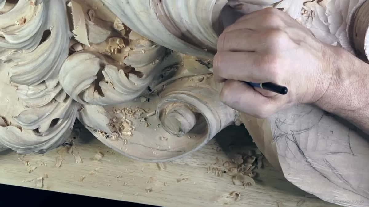
Why does a separation go closer for a curly look?
To match everything else on the leaf. One separation still didn't look too good, so I carved a little closer one, because it has to be the same everywhere else. I thought that would be more authentic to the overall look, like a curliness.
How far apart the divisions go across a whole leaf is a different lesson, workshop 34. Closer isn't crowded, either. In workshop 35 I crowded some separations and had to merge them into one part. Why old leaves carry extra separations at all is in workshop 14.
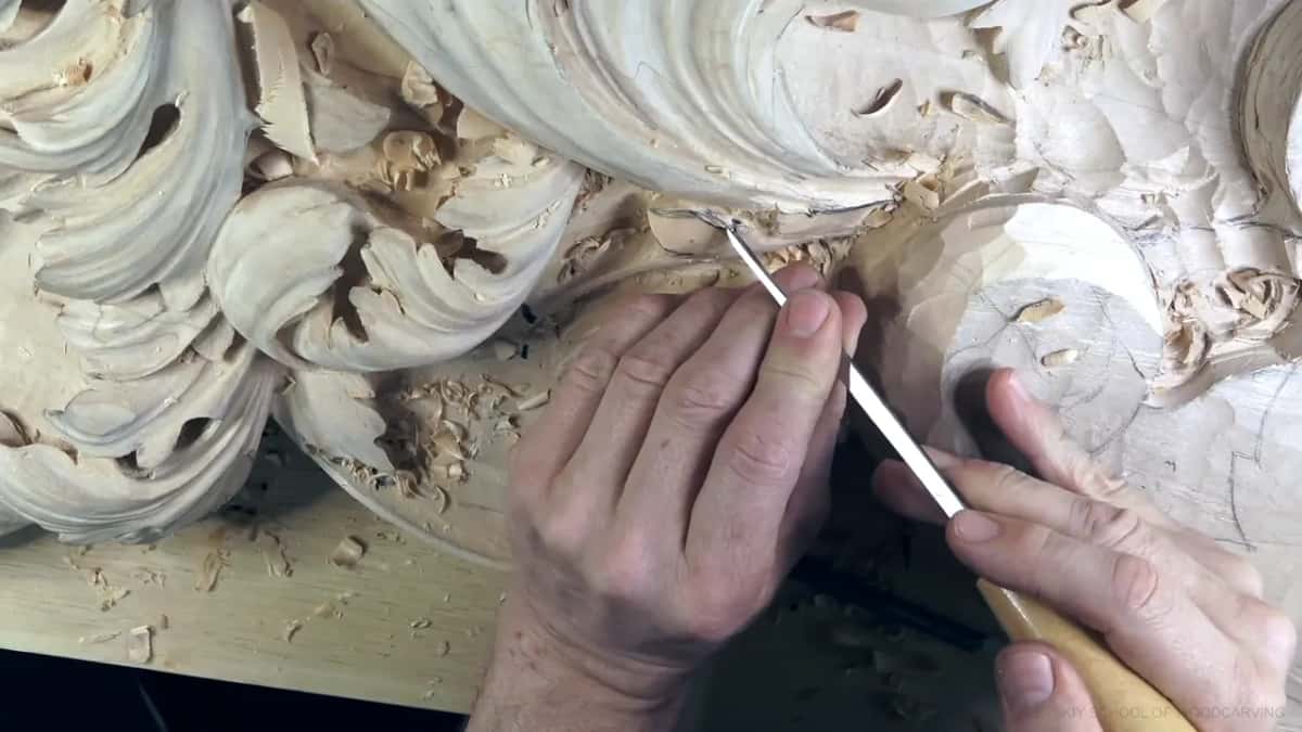
Let me tell you a story. Those small ones went into a part of the leaf that wasn't in my plan when the workshop began. I had left some wood rough there on purpose, because I hadn't made my final decision about it. I knew I wanted something there, just not what exactly. Partway through the workshop the idea came, like a light bulb, and I jumped over to that side of the board. A eureka moment, I said, and then took it back. Not eureka, not really.

By the last part of the workshop the leaf was already becoming curly. That meant being more careful, I said. A lot more careful. Two more divisions went in and flipped one way, a part went underneath, and I called the whole thing a full motion. In the final minutes I said you should be able to see the main movements by now, and that the edge was good.
Is the preliminary cut worth it on a small S?
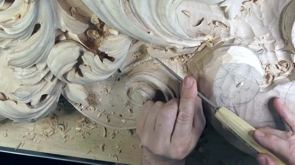
I went to try without it and stopped. I didn't feel comfortable without that preliminary cut, so I made it, and then the separation. The same thing came up earlier at the point of the big S, where I said using the #5 right away would be a mistake. I needed to separate it before developing it, and I said so.
Does the S have to look clean yet?
Not on this panel. I still had to clean it and so on, I said, but it was okay. Some of the clean up I even did off camera, and I mentioned it. Cleaning is a part of a job, I said that day. Even when I was happy with how it was developing, I double-checked.
At one point I told you on camera it's okay if you don't always understand what I mean when I say something doesn't look good.
Should you draw the S in pencil first?
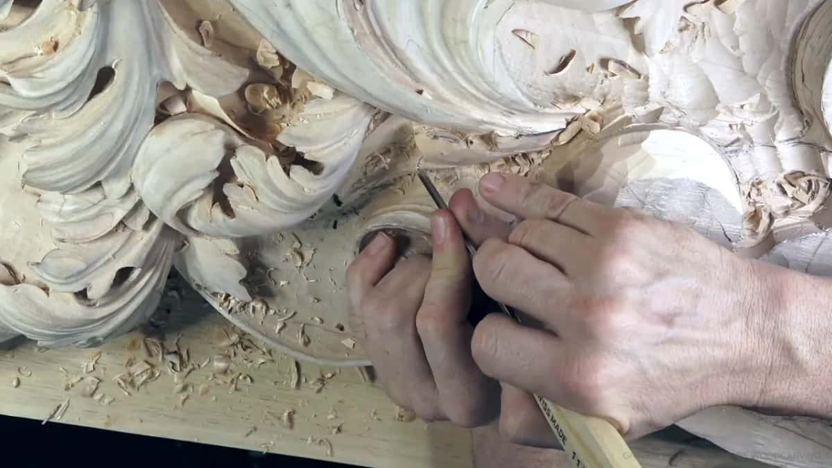
I'd rather not, even though you'll see pencil on this panel. I only started drawing on the wood when I started the school, to show what I'm doing. Pencil makes a lot of mess and it's hard to clean. Twice in workshop 47 I took pencil marks off, and one time the pencil hid the pipe so well that, as I said, you really couldn't see it, though it was there. Don't pay attention to those pencil marks, I said another time, since I know they're distracting.
The marker left too much black once, and I cleaned a little of it off. Here it's fine, since the carving will be painted anyway. What a marker does to wood is a different story, and I told it in workshop 33.
Where to watch this S go in
Every cut on this S is in workshop 47 of Venice Room part 4, twelve parts in a row, about seven minutes each. Workshop 46 before it and workshop 48 after it are on the same relief.
Is there a capital S in your head right now? Could you turn it to face the other way? Then you can plan one on a leaf before your first cut, the way I did.
Somewhere in the middle of that workshop I blew the chips off with a fan, not my mouth. I also said rotate when I meant round, and apologized for it. Another time I said sorry for a view you probably couldn't see anyway.
How it's done
- Plan the S first. Decide where it goes as a movement first. The divisions inside it can wait, the way mine did.
- Set the shape right away. I wasn't sure I liked the piece yet, and I made the S anyway.
- Chop the point. Pick the gouge that fits it. Mine was a #5, and I called the cut beautiful.
- Separate before you develop. Where another element grows underneath, make that separation first. Going at it with the #5 straight off would have been a mistake.
- Outline small ones with a small veiner. The first eleven I tried was too big, so a smaller one did it.
- Make the letter in two passes. First pass, flip the gouge, then a second pass going the other direction.
- Round a tip that comes out too pointy. A #7 did mine.
Frequently asked questions
Do you draw the S in pencil before carving it?
On camera I do, and only since I started the school, so students can see what I'm doing. If it were up to me I'd leave pencil off, since it makes a mess that's hard to clean. For this panel it barely matters, because the carving gets painted.
How strong should the S be on a carved leaf?
Clear enough to read as the letter. I called my first one on this leaf a really pronounced letter S, and when I repeated a division I said the new one had to be more pronounced. Leaving a separation to just follow the natural movement shows up in some designs, and I didn't need it.
Why did one separation go closer to the next?
Matching the rest of the leaf was my reason. A separation still didn't look good, so I made a little closer one, since it has to be the same everywhere else. I thought the overall look would be more authentic that way, like a curliness.
What to carve next