
Alexander Grabovetskiy, woodcarver, School of Woodcarving · Published 2021
Why does my wood carving look heavy?
Quick answer: Heaviness in a wood carving is something I work against with smaller tools and deeper dark spots. In workshop 117 of the Venice Room I stepped a number 11 down from 5 mm to 1 mm under one division of an acanthus head, and said the smaller tool gives lightness, so the leaf would not read as heavy.
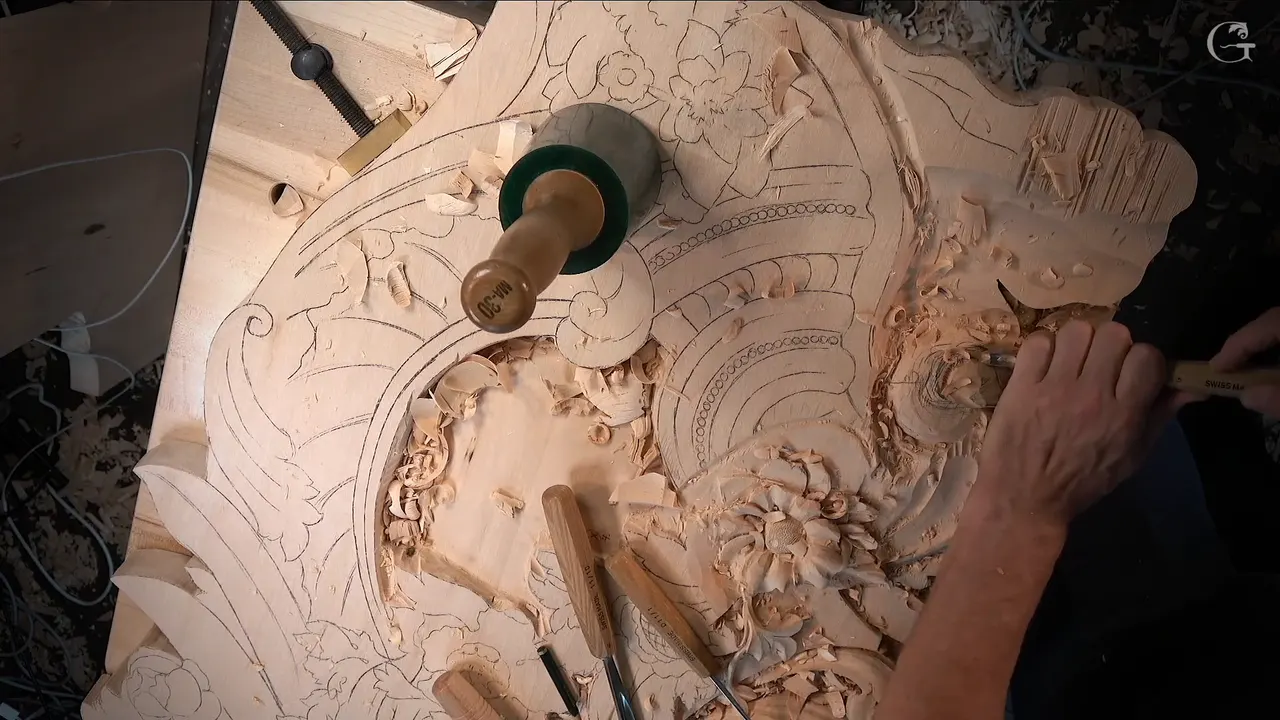
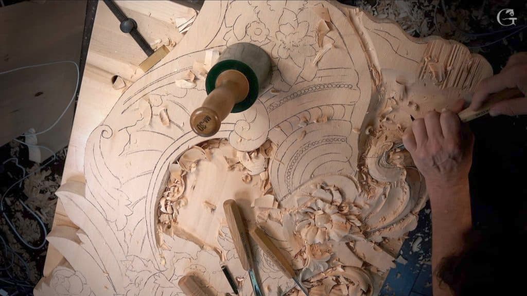
A wood carving that looks heavy is one I lighten with shadow, and most of the time the board stays solid. In workshop 117 I went under a division of an acanthus head on the Venice Room panel, using a number 11, and I kept picking up a smaller one. It started with 5 mm and ended with 1 mm. I said why on camera. The smaller tool gives lightness, and the leaf will not look as heavy. The relief carving techniques below come from nine of my lessons, and in every one I talked about that lightness while I worked.
Have you ever seen a carved leaf that looked more like a lump of wood than a leaf? Would you like your own work to feel lighter than that? Lesson 117 does it with a U shaped tool that keeps getting smaller.

A heavy look is easy to see. Naming it is harder, so I will show you what happened in lesson 117 first, and then the same worry in eight other lessons, with the tool I held each time and the words I used.
Seven moves that take weight off a carving
Going deeper below a single division with smaller and smaller number 11s, 5 mm all the way down to 1 mm, in workshop 117.
A 7 mm first, to open the next eye wider.
Moving an eye much closer, as I did in workshop 53, so the leaf reads lighter.
A fresh eye with a 1 mm veiner in workshop 144.
Holding back one more separation in workshop 127, because I said out loud that the leaf would lose some lightness with it, and letting that piece go right underneath instead.
Rolling a part from underneath in workshop 143.
A stem kept thin on the furniture panel, with a #7 run closer to its line.

What did I do to the acanthus head in workshop 117?
I planned it out loud and then went deeper with smaller tools. The first section of the lesson, where I laid out the main movement and only hinted at an undercut, has its own page, back in workshop 110. Here I pick up from part two.
It opens with a big tool still working the movement. Then a small slip. "Oops. Too deep. But that's okay," I told the camera, and kept going. Right after that I switched to smaller tools and cleaned the section a bit.
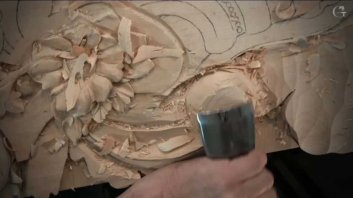
Next I stopped and thought, and I let you hear it. Where does the eye go? Which way does the movement run, and where does the pipe travel once it leaves the eye? And the big one, where does my point go? I made those calls as I went, and I moved one line after I drew it, because I thought that would probably be better.
At one spot I showed the pipe from a different point of view, in case it did not make sense on camera.
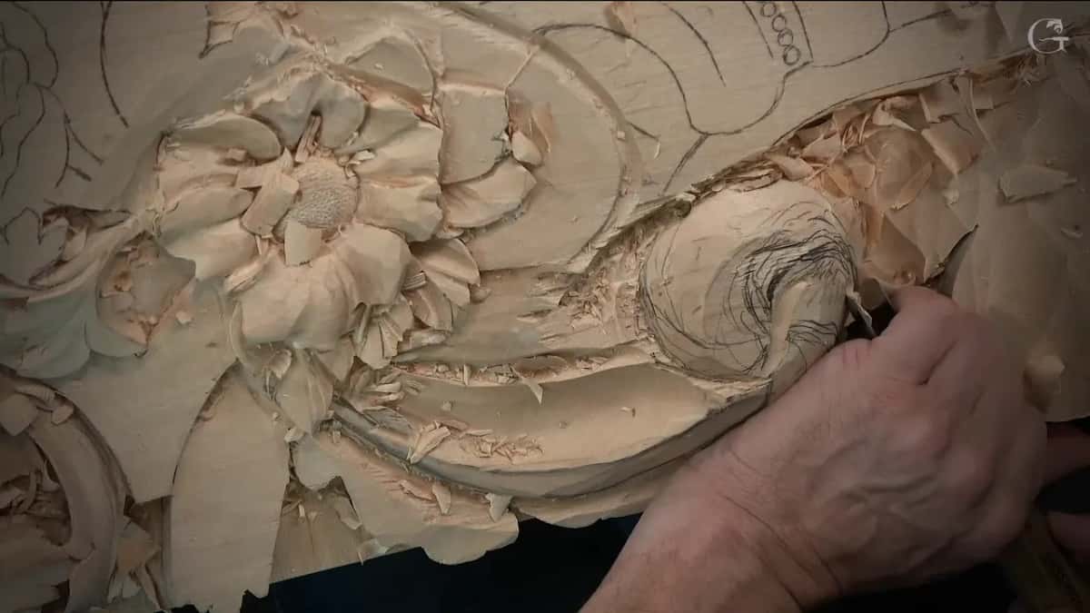
I also weighed a bigger move. I could make it much lighter, I said, and dig out a bunch of material to get a deep shadow there, the way I did earlier on this panel. My honest answer was that I was not sure I wanted to. I could also flip the leaf even more, so it seems to run all the way out and come back to the same point. Either way, the first pass had its place already.
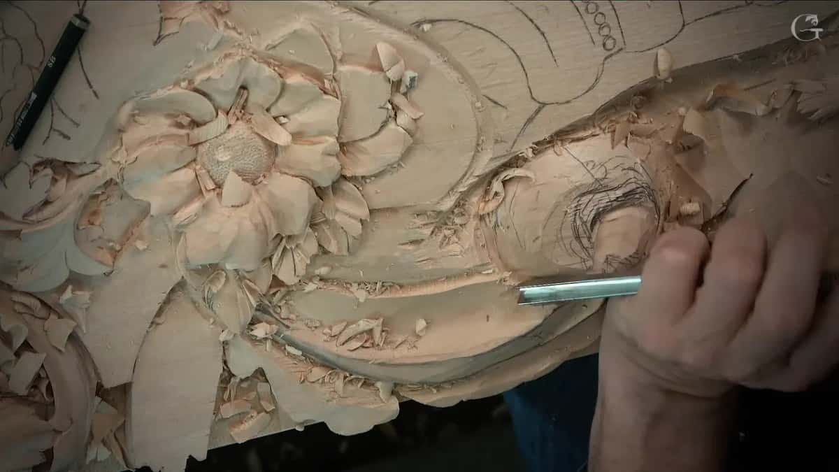
That pass went in with a 10 mm (3/8 in) number 11 gouge. Before I could lose the idea, I chopped out a ridge right away. That separation had to go underneath the main movement.
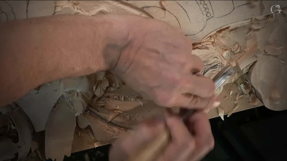
After that came the count. I was not sure about four separations, so I settled on three. One belongs to the main movement. Next comes a second one, which is this chunk. The third will be a little smaller. My concave went in after that, started from roughly where the eye was going to be.
Why did I keep switching to a smaller number 11?
Lightness comes with a smaller tool, and that is the reason I gave on camera. Part three starts with one more decision, though, and it matters for the weight.
One leaf and one point were fighting for the top. If the leaf sat higher, the point had to be buried underneath, rolled inward. The other choice was to let the leaf run right up to the point, and I did not think that would look good. So I rolled the point under the leaf and changed the overall movement to suit. Much better, I thought.

Once the leaf was raised, the wood around it had to come down, since I did not need any more material there. With a smaller #11 I cleaned that area and started undercutting a little. I kept a wall of about 10 mm (3/8 in), because the concaves and convexes were still ahead of me and I did not want to make a mistake.
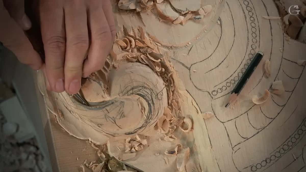
Now the run of sizes began. A 5 mm (3/16 in) went under the second division. Next came 4 mm (about 5/32 in), deeper and smaller again.
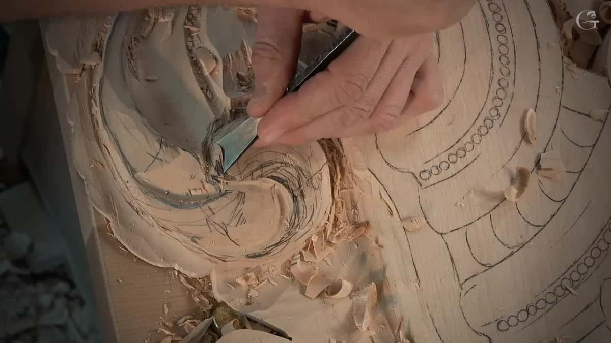
That is the moment I said why. The smaller tool is going to give me lightness, and it is not going to look as heavy.
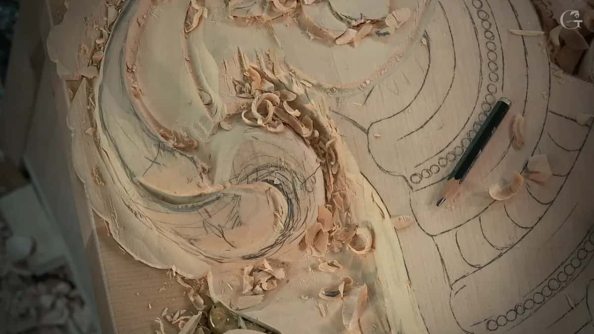
From there it was 3 mm, one-eighth of an inch, and after it 2 mm (0.08 in), which left what I called a beautiful, deep, really, really deep shadow. The last one was 1 mm (0.04 in). I named that the final depth.

On the next section I used the same, same, same idea, with one change at the start: a 7 mm (about 9/32 in), to get that eye a little bigger. Back down to 5 mm after that, and on to 3. "I am after big and deep shadows," I said.
Near the end I added a thought for anyone who already knows the logic of these heads. Sometimes a second leaf can even overlap the main head. It is up to the wood carver to decide what is going to look better, and there are many ways to finish an acanthus head.

Relief carving techniques that lighten a leaf and keep it solid
Most of these never open a hole through the board. That route belongs to the pillar page for Part 10, where the light goes right through. What follows are the other ways I have lightened a leaf in front of the camera, each one said in my own words at the time.
Painters call the play of light against dark chiaroscuro, and designers talk about visual weight and contrast. I just say lightness, and on this relief panel I got it from dark spots carved with small tools.
Take the eye first. On a leaf in workshop 53, back in Part 5 of the room, I was about to carve the same eye I had made before, a 5 mm #11. Then I stopped myself. To make it look lighter, almost like air, that eye had to come much closer. Another eye would go on the other side to repeat the movement, and I apologized that you could not see it and said that way would be much more logical.
Part of the pipe I had made would have to go. I said I could go even deeper with that separation, too, because there was plenty of material.
Much later, workshop 144 had me walking around the panel to blend a part with a back bent, because it was not too convenient for me there. An eye went in again for the same reason, lightness, and the 1 mm #11 did it. "So far, I like what I see," I said.
Right after, I started concaves on both sides of the pipe, shallow at the beginning and more pronounced later. I really want to see that pipe, I told you, twice.

| What I changed | The lesson and the tool I used | What followed |
|---|---|---|
| Smaller number elevens | Lesson 117, five sizes of number 11 | Less heavy |
| Eye brought closer | Venice Room 53, a 5 mm eye | Almost air |
| A new eye | A 1 mm veiner in workshop 144 | Looks lighter |
| One separation skipped | Workshop 127, where that piece goes underneath | Stayed light |
| Rolled from underneath | Workshop 143, an undercut at 3 mm | Seemed lighter |
| Thinner stem line | Furniture Panel 31 and its number 7 | Lighter, nicer |
Does another separation always make a carving lighter?
Another separation helps only up to a point, and in workshop 127 I caught myself at that point. My pencil put in another separation, and another, and maybe one more, and I said that would give me some lightness.
A minute later I thought about adding one more still, and I said it would not be as light if I did. I went back and forth, honestly. In the end I decided that piece would go right underneath. You can watch it in workshop 127, where I also relieved the little triangles before anything else and called that always a good idea, so you do not rush it with the number 11.
Over in workshop 143 I asked myself a question on camera. Should I do a separation on that side or not? Maybe not. Instead I moved the middle line and planned an undercut going underneath, so the part would look like it was rolling from underneath. That left me only one bigger separation, and I thought it would look lighter. The undercut went in with a 3 mm.
One workshop earlier, in workshop 142, I lowered a part and gave it a concave with an undercut under the line. Even a really nice transition there would still show, I said, and I did not think I would like it. Some subdivisions there would help it look lighter. That lower leaf was going to lie on top of a simpler shell, so the upper part could stay much lighter and much more open. I reached for a big number 11, 30 mm (about 1 3/16 in), to start that concave, and said I hoped for a much better result.

What made the stem on the furniture panel look lighter?
A number 7 run straight down, closer and closer to the stem line, did it. That was in Carving Furniture Panel 31. Before that I rolled a flatter tool right underneath one part to give it a little more movement, and I liked that much better. My plan was to open it up a little more in two spots.
Same idea right beside it. I think it's gonna look lighter, nicer, I said. A #3 and a 3 mm refined the stem, and I wanted it no thicker than a millimeter and a half, about a sixteenth of an inch.
A half millimeter veiner would dig an even deeper shadow there later. It was a little too early for that, so I moved on.

Can a carving look too light?
Sometimes I want less of it, and on the Lily Box I said so. That lesson is mostly about color. I made one spot really dark to bring out the three-dimensional effect. Another I kept only a little darker, because the wood was already a lighter one.
Too much dark around it, I said, would bring the lightness out even more, and that was not what I was after. The color went darker at the bottom and much lighter at the top, almost like an effect of glazing. You can see it in Lily Box 13.
Some of this is plain love, too. Workshop 66 has me connecting two points with a 3 mm number 9 from Ashley Iles, and I said any brand will do if it is a true number nine, like a half circle. That spot already had a hole in it, the pillar's story. Everything underneath got cleaned out to give that lightness. Some of the stuff is really not necessary, I admitted, but I love it.
Sometimes I ask myself, why don't I do it? There is no answer. So I still would. A few seconds later a small number 5, a quarter inch, about 6 mm, came out, and I had to be careful, because I was working against the grain.
Where can you watch these moves?
All nine lessons sit inside the school. You will find lesson 117 in Part 10 of the Venice Room, between workshop 116 and workshop 118, on the same Venetian style panel as the rest of that room. The furniture panel lesson sits in the third furniture panel course.
Every lesson named here, and every other wood carving lesson in the school, opens with full access to the school.

Can you think of one carving, yours or anyone's, that looked a bit thick? Would a darker spot in it have helped? Try the next size down of the tool you used, in the same line, the way I did in lesson 117.
How it's done
- Decide what sits on top. In lesson 117 I let the leaf sit higher and rolled the point in underneath it.
- Begin at 5 mm. Take a 5 mm number 11 under the division, the way I went under the second one.
- Go down one size. Switch to 4 mm and go deeper, then 3 mm, which is one-eighth of an inch, and then 2 mm.
- Finish at 1 mm. The 1 mm goes last. In my lesson that was the final depth, and I moved on to the next section after it.
- Repeat on the next section. Same idea on the next part of the head. There I started with a 7 mm to make the eye bigger, then went back down to 5 and 3 mm.
Frequently asked questions
How do I make my relief carving look lighter?
Smaller tools did it for me in lesson 117. I went under a division with a number 11 at 5 mm, then 4, 3, 2 and 1 mm, and said a smaller tool meant lightness. Moving an eye much closer did the same job in workshop 53, where I wanted the leaf to look like air.
Do I have to carve a hole through the wood to make it look light?
Holes are one route, and my page on the Part 10 panel is about them. On this one the board stays solid while eyes move, a separation gets skipped, a part rolls under its neighbor, and a stem stays thin. Each of those came from a lesson where I said it would look lighter.
Why use a smaller gouge to go deeper?
A smaller number 11 gave me lightness, and I said so on camera in lesson 117. Stepping down to 2 mm left what I called a really, really deep shadow. The 1 mm came last, and on the next section I began at 7 mm to open the eye.
What to carve next