
Alexander Grabovetskiy, woodcarver, School of Woodcarving · Published 2023
How do you carve shadows into a relief carving?
Quick answer: Shadow in a relief carving is a decision, not an accident. You drop one edge of a leaf nearly to the ground, hold the far edge up, and let the slope between them catch the light. Alternate that slope leaf by leaf and the panel keeps changing all day.
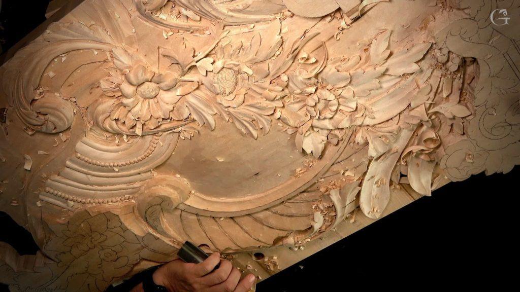
Shadow in a relief carving is carved, not lit. A leaf drops one side low, the far edge stays high, and the surface between them tilts. The neighbour leaf then tilts the other way. Light at four in the afternoon finds edges that noon light walked past.
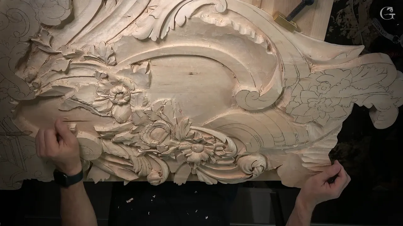
Your leaves are deep. You went right down to the ground in places. Stand back, and the whole panel still reads like a rubbing, flat as a plate.
Have you carved a leaf that measured deep and looked shallow? Do the hollows go black on your bench and grey on the wall? Depth is what you measure. Shadow is what people see, and the two are not the same thing.
Workshops 132 through 143 of the Rococo Venice Room panel are about aiming light as much as removing mass. Three flowers, a run of beads, one double leaf, and a mistake I made with the camera running.
What the shadow is actually made of
- A tilt. One edge low, the far edge high, not both at one level.
- An alternating tilt, so the leaf next door leans the opposite way and the light never repeats.
- Roughly 3 mm (1/8 in) of air held back for the undercut you have not made yet.
- Waviness.
- A hard stop drawn on the wood before any waste comes off, so you know where the pass must not go.
Why does a deep leaf still look flat?
A leaf reads flat when both of its sides sit at the same height. What the eye reads as shape is the step from light into dark across a surface, and a level surface has no step in it anywhere.
On this panel I keep asking which way, as well as how deep. Which side goes down? I make that decision on camera several times in these twelve workshops, and the point of view often settles it. Then I drop that side almost onto the surrounding surface and leave the far side standing.
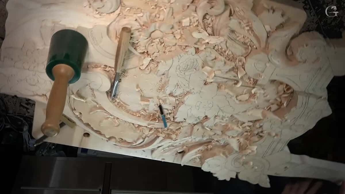
Those concaves make a big difference as far as the shadow and light. Huge difference. The whole trick is one decision, and a decision costs nothing.
Which edge of a leaf drops first?
Point of view decides a lot of it. So I think about where the piece will really be seen from. This panel goes into a room, and the client is going to look at it from one position. The side that shows from there is the side I can take much deeper, and that makes a huge difference.
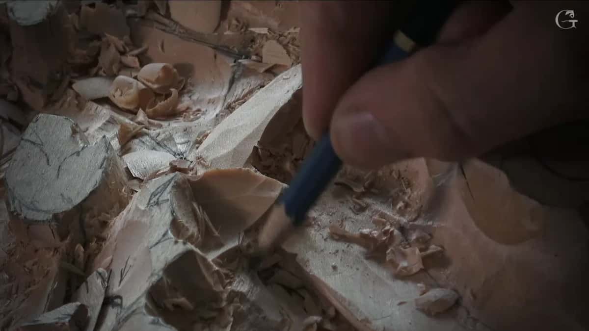
Then I redraw. The pencil goes back on long before the shape is final, because the waste I just took off carried my line work away with it. A drawing you can still read is the difference between deciding and hoping. I redrew that first leaf more than once, and I would do it again.
On the first leaves of workshop 132, one ridge sits no more than about an eighth of an inch, 3 mm, above the line of the long leaf running underneath it. That is not much, and once I undercut you see it much more clearly.
Why should the next leaf tilt the other way?
Light moves through a room all day. A panel where every leaf leans the same way looks alive for part of the day only, because the sun that lit those hollows in the morning is coming from somewhere else by dinner. I sloped two of these leaves one way and the third one the other way, purely for the shadow's sake.
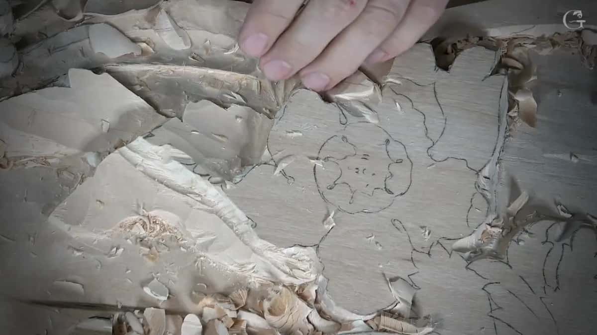
Try it on two leaves side by side. Drop the left edge of one and the right edge of its neighbour. I think it looks nicer that way. If you want the start of this room, the eleven parts before this one come first.
How much air do you leave for an undercut?
Three millimetres, 1/8 in, held back before I need it. An undercut is what turns a step into a shadow, and you cannot make one if the wood behind the edge has already gone. While the shape is still rough I leave that sliver everywhere an edge will eventually float.
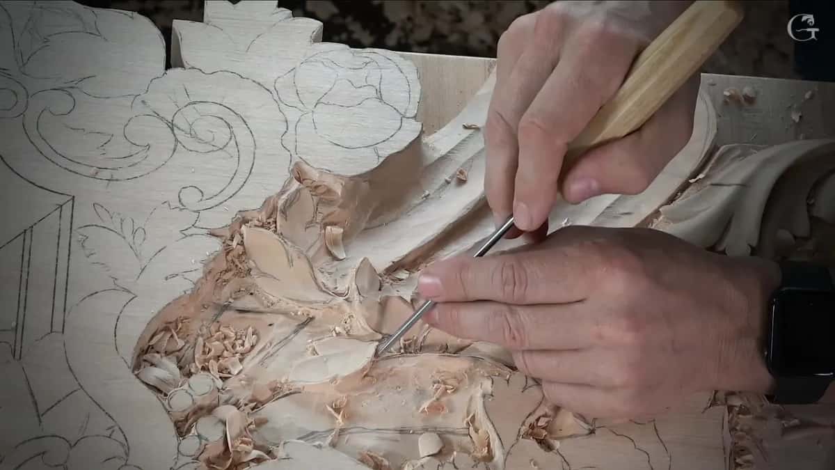
Undercutting runs down the sizes. The first pass in is a number 11 at 3 mm, right up to the pencil. Then 2 mm, then 1 mm in the tight spots, and half a millimetre where the shadow has to read black. Some of those places are fragile by then. Fragile and awkward. It is a weak part, but I need that shadow, so I go in anyway, mallet in hand for control.
An opening is a different animal. In one spot I went right through the wood on purpose, because that section was reading heavy and real light through a real gap makes it lighter. An undercut fakes air. An opening is air. Both are decisions, and neither one is an accident.
Which gouges do the shadow work?
A number 11 veiner does most of it, in a lot of widths. I use the same tools over and over in this project. Here is what the twelve workshops actually used.
| The tool | What it does on this panel | Widths I used | Why that one and not some other |
|---|---|---|---|
| The 11 veiner | outlining, undercutting and dropping one edge low | 0.5 to 30 mm | one sweep carries nearly the entire job here |
| Number 7 gouge | slopes, concaves, rolling a petal back over | 14 mm to 3 in | waviness, and it leaves no flat spot behind |
| Number 9 gouge | the plug pass that sinks a centre | 20 mm, 3/4 in | round bottom, deep bite, quick way down there |
| Number 3 gouge | stops straight down, blending a ridge away | any width that fits | nearly flat, so it cleans up very well |
| The back bend | inside a curve a straight tool misses | 6 to 13 mm | reaches right under the roll without walking around |
| Spoon and skew | the dome hidden inside a flower centre | 2 to 13 mm | gets where straight steel simply will not go |
| A steel punch | texture laid straight over a carved grid | more than one size | blends two fighting directions into one calm surface |
Sharpening is not a stage that happens before the job. Halfway down one hollow in workshop 143 the tool needed sharpening, so I stopped, took care of it, and came back. Much better now. If you want that part on its own, it lives in the sharpening course, and the full set is laid out in all about tools.
What is an eye in a carved leaf?
An eye is the small pocket of shadow where two movements meet. On a real acanthus leaf it sits at the root of every lobe, and it is half the reason such a leaf looks alive at all. These leaves are not acanthus. The idea for one flower here comes off a 15th century building in Venice, and the leafage does as it pleases. Even so, wherever I see a spot that wants an eye, I give it one.
The pocket takes a single pass. A small number 8 at 3 mm goes straight in like a plug, and I blend outward from there. Beside it a pipe has to pop up, a convex. Eye down, pipe up. That pair is what the Corinthian acanthus is built out of, and it carries over to leafage that has no name.
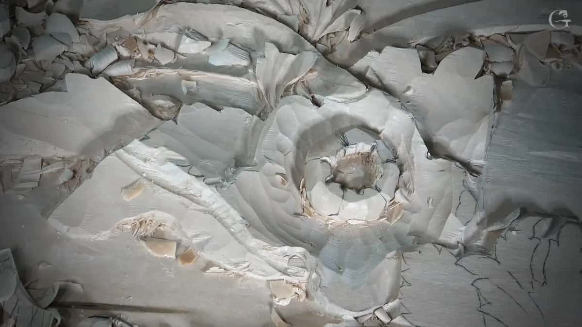
Divisions behave the same way. Around the middle of the first flower I marked five, then made sure no two of them sat at one level. Each slips a little under the next, and the pattern never repeats itself around the ring. Otherwise it just does not look as natural.
Why carve a flower wavy instead of round?
Nature holds no clean circles. A petal ring carved even and symmetrical all around is not going to look nice, and you will never find a perfect shape out there in creation. I like waviness when I carve flowers, and waviness is only a plus.
Wavy does not mean careless. By a Fibonacci sequence a shape in nature is still perfect, so it depends what you mean by perfect. What it is not is symmetrical. Two different words.
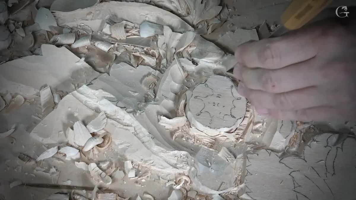
Here the order of work matters. I carve the centre first, before the ring of petals around it, because it is more stable now and there is less chance of breaking it. Some of the undercut even goes in right away, before I work on the petals.
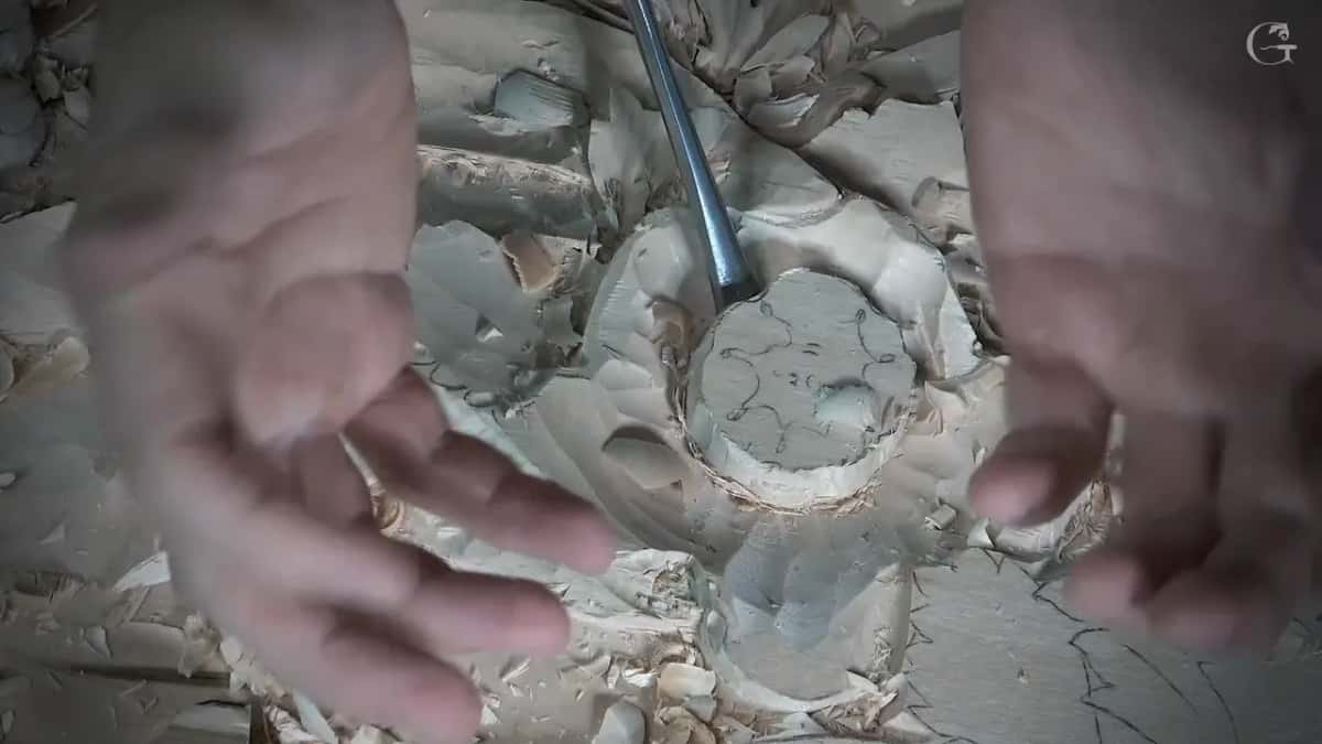
Sinking that middle takes a number 9 at 20 mm, three quarters of an inch. About five millimetres down for now. I could go six, about a quarter inch, but five is also good, and it is not the end yet. Then the wavy edge gets chopped toward the centre, which makes it a lot easier for me later on.
What makes a petal look like it was applied separately?
Carve the edge nearly paper thin and hollow the wood out from underneath. Look at those flowers and they seem to have been made separately and glued on. They were not. Same board, one piece of wood, and the whole illusion is a thin edge with deep shadow behind it.
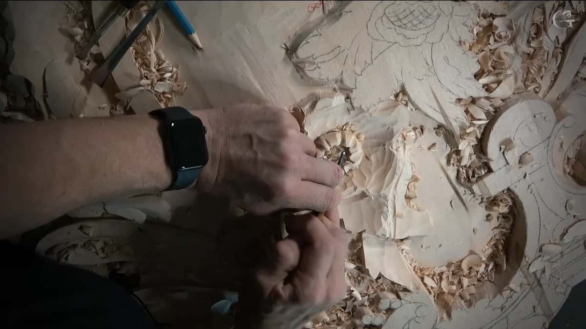
Rolling does the other half of the work. A petal that lifts from the middle, goes over, and then rolls back underneath is doing three things at once, and I get there with a number 7 held upside down, a little at a time. Roll it hard where the flower crowds the leaf next door. Without the roll it looks a little off, and with it the petals feel stretched to the right shape.
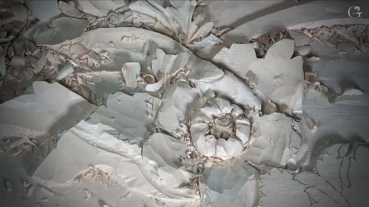
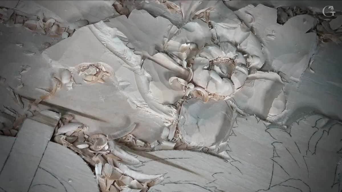
Then round everything, slice by slice, in all directions. I do not want one flat spot on a flower. Not even one flat surface, or it stops reading as three dimensional and starts reading as a shape that owns some petals. Slow work. It is where the Hashemi flower project earned its hours, so here more of it happens off camera.
How do you carve the centre of a flower?
Draw a grid on it first, in two colours. Here I lay out two sets of lines that swirl against each other. One set runs in toward the centre. The other arcs the opposite way, closer to a golden ratio curve than to a plain radius, the way you would see it in nature.
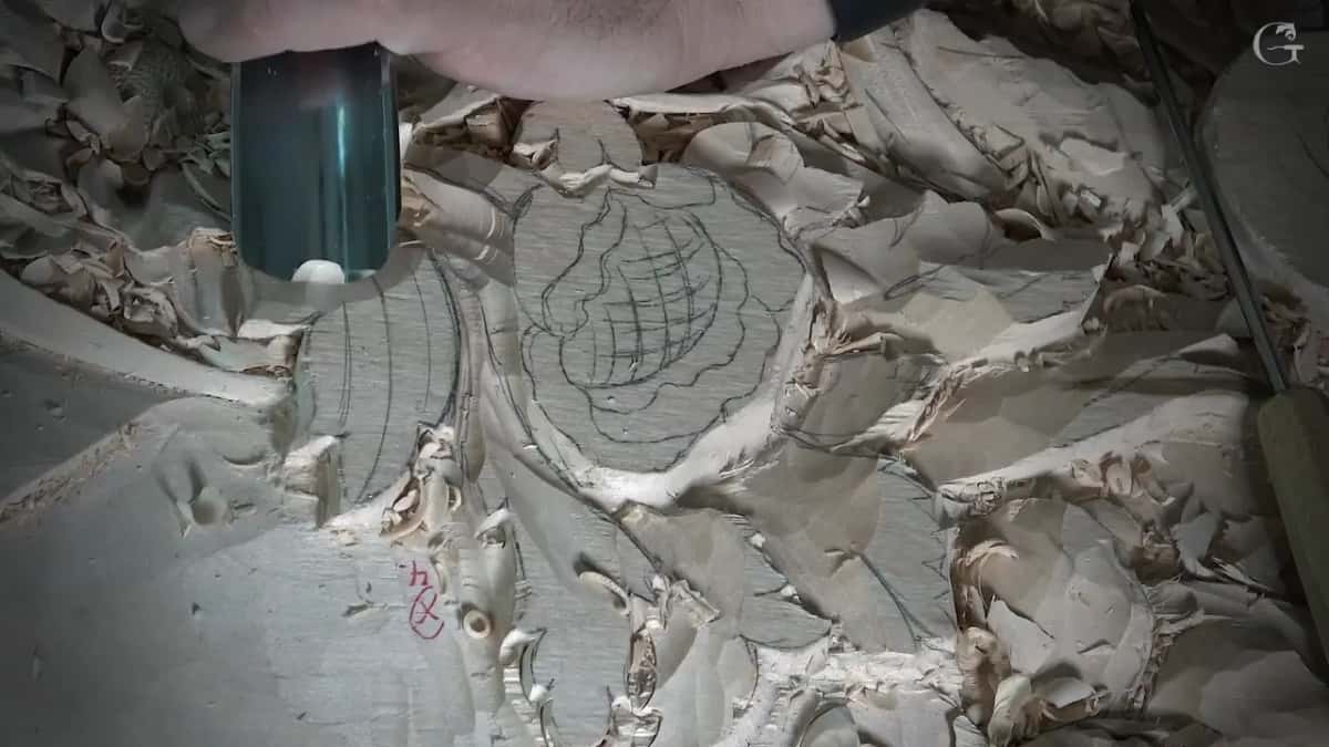
Finding that middle is not guesswork. I take the two edges, divide the span into ten, and move six parts across. The centre lands off true and lines up with the rest of the movement really well. That one move is the whole measurement. Then orange for one set of lines and pencil for the other, so I can tell which ones I have already carved.
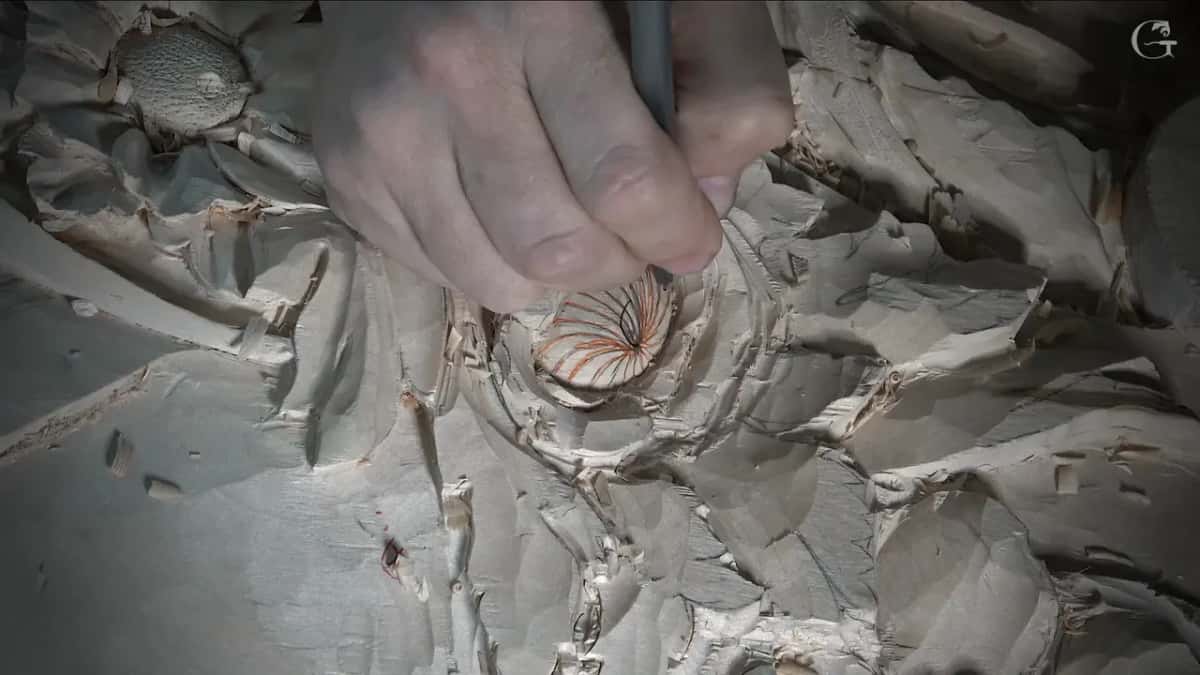
Each line gets one pass straight down, angled a little, then a second pass about 1 mm away leaning in to meet it. A V. Not a V tool, though. You could use one if you wish, but it is not authentic to the period, so I use a skew chisel. Watch the grain in those little arcs, because it turns direction inside the curve and it will chip if you hurry it.
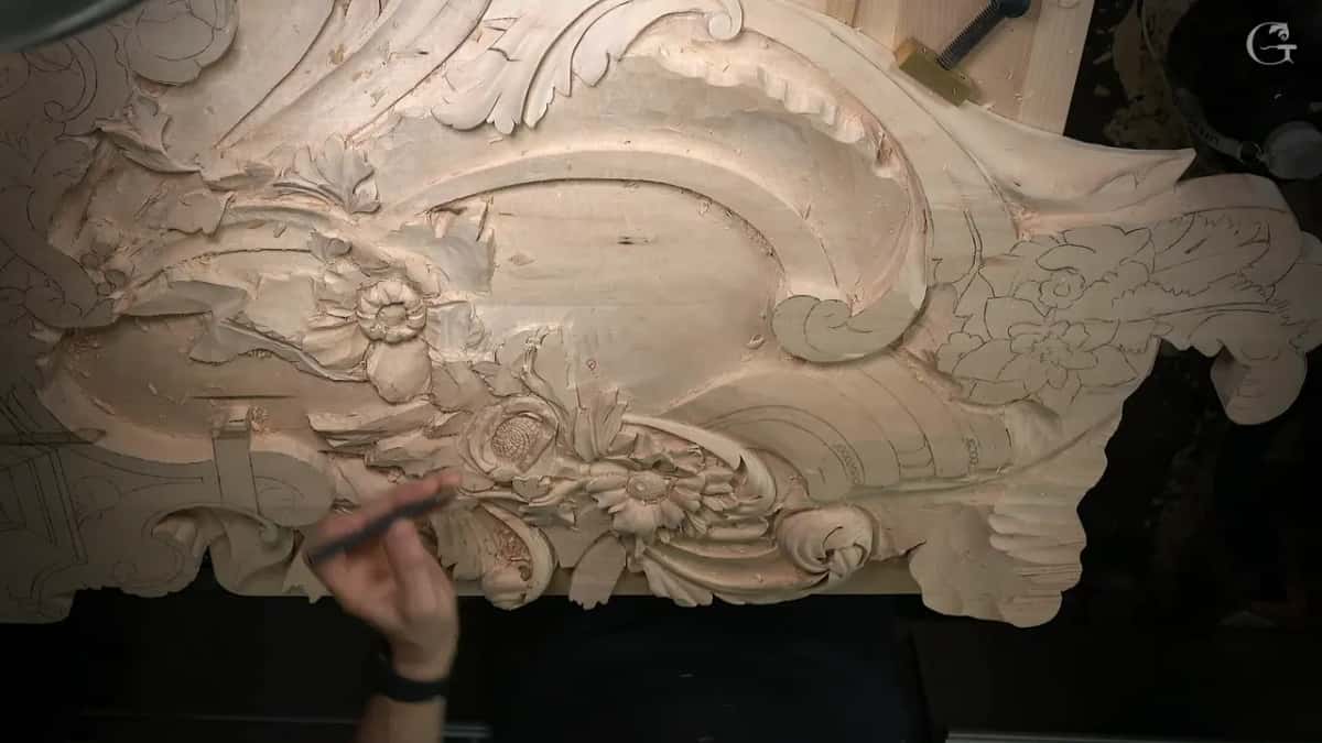
Last comes the punch, straight over the V work I just finished. That saves time on the V cuts, and it looks more realistic. You can still read every line through the texture, and the punch blends two competing directions into one surface. Three flower centres on this panel got the same treatment, which is also how the Venetian rosette holds together.
Where do beads belong on a moulding?
Each side of the bead strip gets split six parts out of ten, and a division line goes there. A row of beads puts rhythm beside a leaf, and the bead and reel has been doing that job since antiquity. What changes from century to century is the shape lying next to the row.
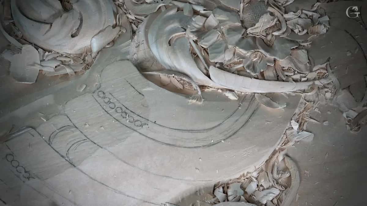
Two of them were common at the end of the 15th century and the start of the 16th. Concave against convex, which exaggerates the beads. Or double convex, two rounds side by side, and that is the one I chose here. The bead strip itself is a quarter inch, 6 mm, and the division lines were worked down the number 11 widths from 7 mm to 1 mm before any rounding starts.
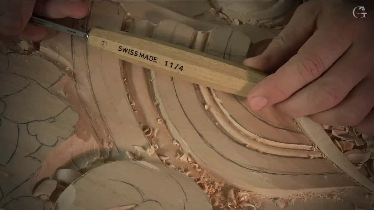
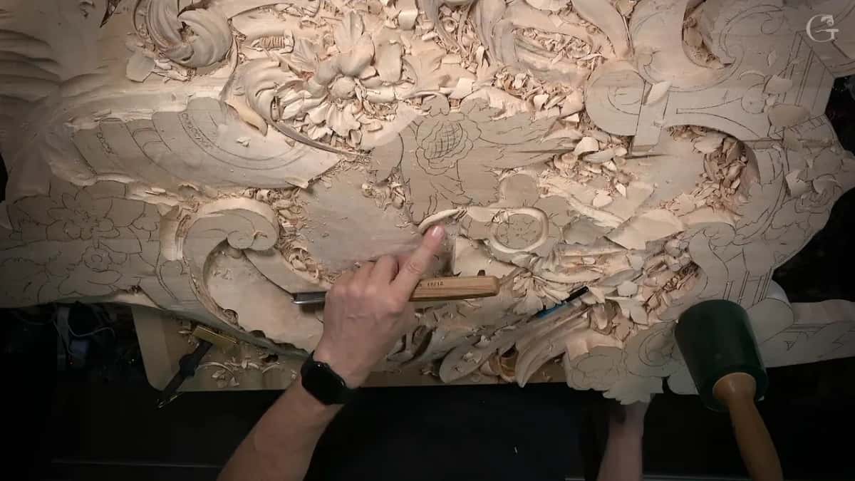
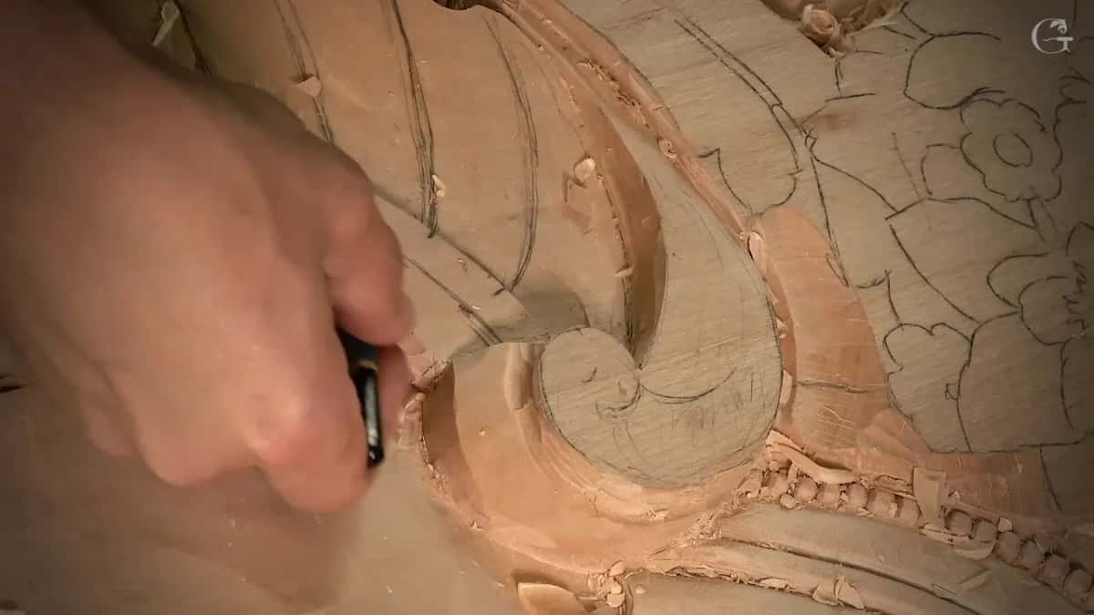
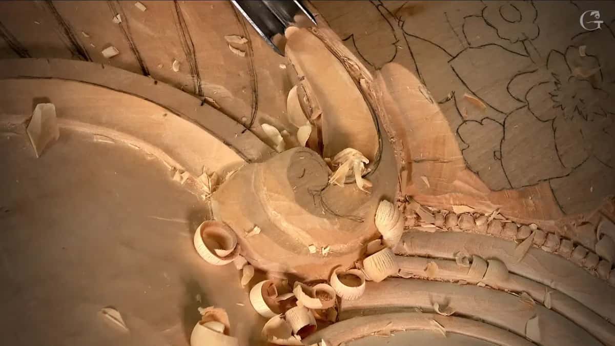
And then I broke my own rule off camera. I moved the division lines off that mark, dropped the overall depth on one side, and popped the beads a little higher instead. It looks much better that way. A moulding is a proportion you check by eye with the wood in front of you, not a formula you obey. The volute beside it shows in the picture below. Acanthus over mouldings works the same argument from the other end.
Do you need a back bend gouge?
A back bend reaches inside a curve where a straight tool cannot follow. You can get the job done without one by walking around the bench and coming at the wood from the other side. With a back bend you set the angle and go, no walking.
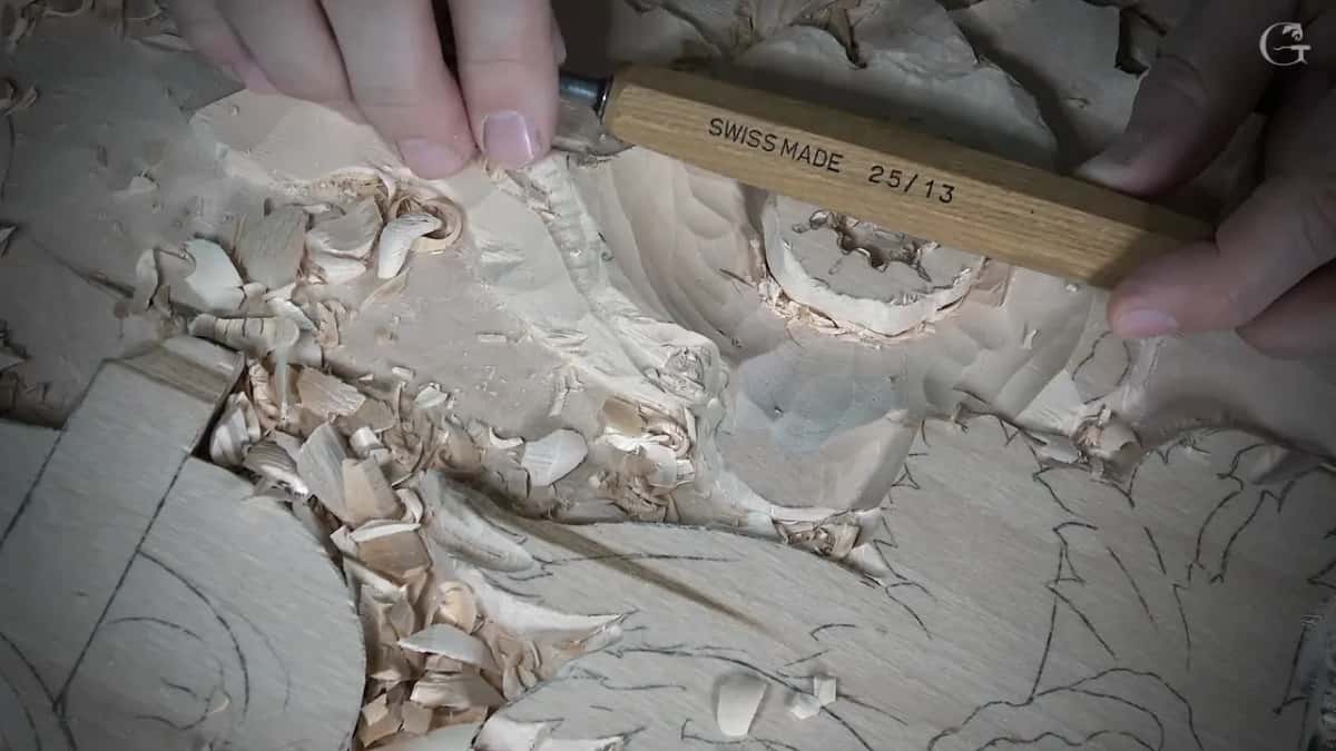
Read the numbers on the handle rather than the shape. A Swiss handle stamped 25/13 is a back bend with a number 5 sweep, 13 mm wide. The 20 says back bend and the 5 says sweep. Mine is reground into a skew on top of that, so one corner can go very deep. Henry Taylor made the back bend I picked up for the beads, and I like how their tools feel. The handles that say Swiss made are Pfeil.
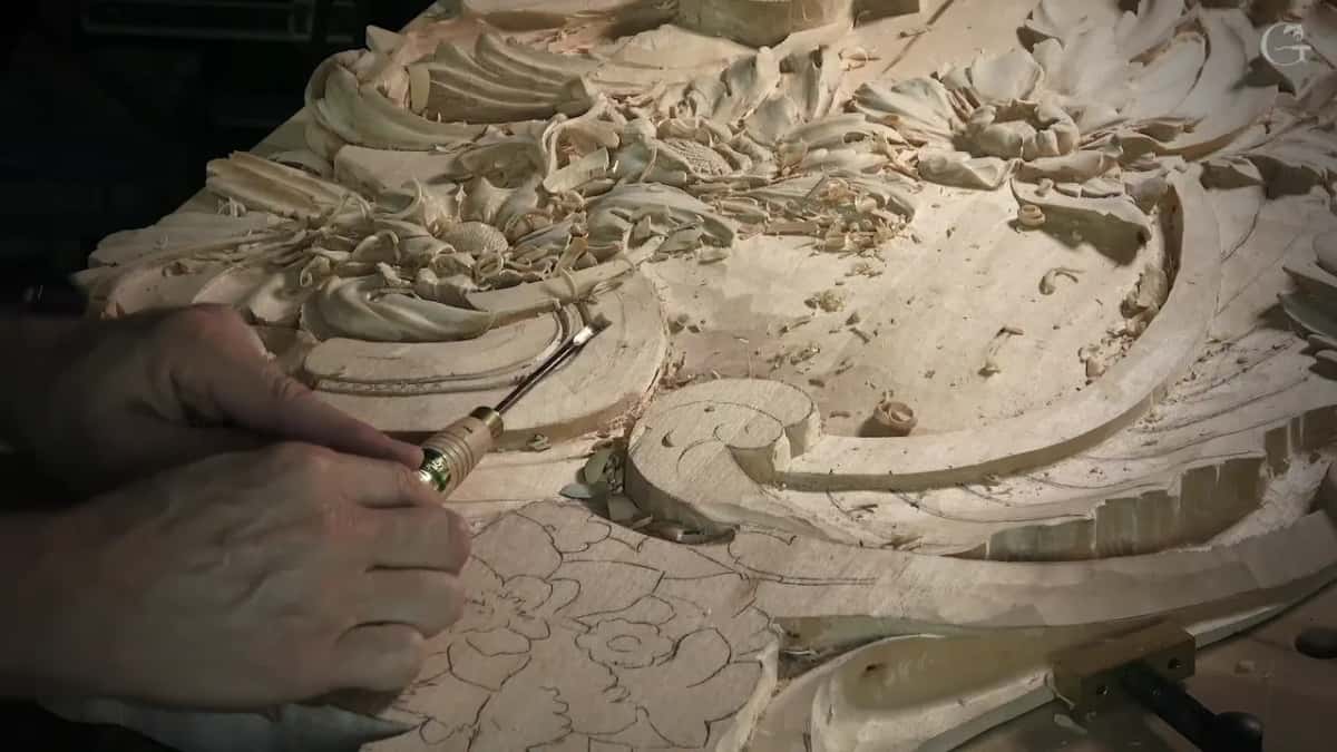
Then step down through the widths. A 30 mm number 11 gets me to depth fast and gives me plenty of control, but at some point I have to switch. Then 25, then 20, then 5/8 in, about 15 mm, then 10, then a spoon veiner at 10 mm and at 7 mm to scoop out the last of it from two sides. One hollow, seven tools.
Why does a carving look worse on camera than on the bench?
A lens flattens the exact thing the tilt was for. When I look at this piece on a screen it does not look as nice as it looks in real life. On the bench two eyes see around a hollow and the shadow shifts as your head shifts. A camera has one eye and it holds still.
Worth knowing if you learn from video, mine included. A section that looks like a mess on your monitor is often a bad angle and a heap of chips. I said it looks like mess out loud more than once here. Once I vacuumed the junk away, you could see a much better picture.
I bought a set of rasps about a year ago and I still do not use them a lot. I used them on a few spots here, left the surface rough because that part gets painted anyway, and went back to gouges. They save time now and then. Sometimes they make a lot more problems, and my normal tools can do a better job.
In workshop 143 I rushed a number 7 and broke off a separation I wanted to keep. I could have glued it back. I did not. It opened the area up, my separation moved across, and the section came out a little lighter. I am not going to tell nobody except you that I made that mistake.
My granddaughter was visiting the day I carved the first flower, and you can hear her in the background of workshop 134. I left her in. These videos are exactly that. A real bench, a real client waiting, forty years of this work, and a man deciding out loud. Everything above is what the panel needed, and the pass by pass version sits in the workshop videos themselves, which is what tuition to the school opens. Not sure this is your project yet? Then start somewhere smaller, or bring a question to the techniques and questions course.
How it's done
- Know where the client will look from. The side that shows from that position is the side you can take much deeper. Settle it before any wood moves.
- Mark the edge that drops. Decide which side goes lower and draw it. Then chop straight down on the lines you want to keep, or you lose their position.
- Take that edge nearly to the ground. Bring it down until it very nearly touches the background, leaving some 3 mm of wood for the hollow you will want later on.
- Lean the neighbour the other way. Give the next shape a reverse tilt, just for the shadow's sake.
- Redraw before any detail. Put the pencil back over the whole area. Roughing carried your line work off with the chips, and the details go on only after the lines are back.
- Hollow out the lip at the end. Walk down the widths, 3 mm then 2 then 1, and 0.5 mm where the dark has to look black. That gets the shadow even deeper.
Frequently asked questions
What gives a relief carving deep shadows?
Tilt the shape and hollow the wood behind its raised lip. A sloped surface keeps light on one half and loses it on the other, and a person reads that difference as form. Where the shadow has to go darker, go deeper with a smaller number 11.
Should every leaf on a panel lean the same way?
Not on this panel. Around one flower I sloped two leaves to one side and the third leaf back the other way, because the light hits from different angles at different times of day.
What size gouge undercuts a carved leaf?
Use a number 11 and walk down from 3 mm to 0.5 mm as the space closes on you. Leave 3 mm of wood under each lip while roughing, or there will be nothing left to hollow. Fragile spots still get done, with a mallet.
What to carve next